
The psychology of color in art shows how different hues evoke specific emotions and influence your interpretation of images. Bright reds and yellows energize you, sparking excitement or passion, while cooler blues and greens bring calm or melancholy. Colors tap into your subconscious and are shaped by your personal experiences and cultural background, making each perception unique. Understanding how colors communicate moods can help you craft artwork that deeply resonates, and if you explore further, you’ll discover even more about their powerful effects.
Key Takeaways
- Colors evoke specific emotions and influence viewers’ interpretation of artwork, such as reds energizing and blues promoting calm.
- Cultural and personal associations shape how individuals perceive and respond to different hues in art.
- Artists strategically use color to communicate moods, create tension, or evoke particular emotional responses.
- Perception of color is affected by context, cultural background, and personal memories, guiding emotional impact.
- Understanding color psychology enhances the ability to craft artworks that connect emotionally with viewers.
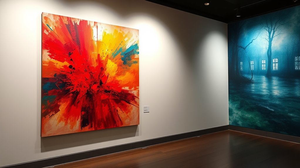
Color plays a powerful role in art because it evokes emotions and influences how viewers interpret a piece. When you look at a painting, your perception of color shapes your understanding of the scene and your emotional response. This is because color perception isn’t just about recognizing hues; it’s about how those hues affect your feelings. Bright reds and yellows can energize you, making you feel excited or passionate, while cooler blues and greens might bring a sense of calm or melancholy. As an artist or viewer, you instinctively respond to these cues, which highlights how deeply color impacts emotional experience. The emotional impact of color is rooted in its ability to tap into your subconscious, often bypassing logical analysis and directly affecting your mood. When you see a vibrant, fiery orange, you might feel warmth and enthusiasm without realizing why. Conversely, a muted gray can evoke feelings of sadness or dullness. This emotional resonance is what makes color so effective in conveying meaning without words. Additionally, understanding the psychological effects of color can help artists intentionally evoke certain moods in their work. Your perception of color is also influenced by context, culture, and personal experiences. For example, in Western cultures, white is often associated with purity and innocence, while in some Eastern traditions, it symbolizes mourning. These cultural differences shape how you interpret color’s emotional impact. Likewise, your personal memories and experiences can color your perception, making certain hues more meaningful or emotional for you. As an artist, understanding this allows you to craft compositions that evoke specific feelings in your audience. By choosing particular colors, you intentionally guide viewers’ emotional responses, creating a more powerful connection to your work.
Color influences emotions and perceptions, bypassing logic to evoke feelings through hue and context.
The psychology of color in art also reveals that certain colors tend to evoke consistent emotional reactions across different audiences, although individual perceptions may vary. Red can stimulate feelings of urgency or passion, while blue often induces serenity or trust. Knowing this, you can leverage color to communicate specific moods or messages effectively. For example, if you want to evoke excitement or tension, using bold reds or contrasting warm and cool tones can amplify that emotional impact. If your goal is to create a tranquil atmosphere, softer blues and greens will serve better. Recognizing how color perception influences emotional impact helps you, whether you’re creating or analyzing art, to understand exactly how color shapes emotional experience on a fundamental level. Ultimately, the power of color in art lies in its ability to connect with viewers on an emotional level. It’s not just about aesthetic appeal but about tapping into feelings that resonate deeply within. By understanding how color perception influences emotional impact, you gain insight into the subtle language of visual art—one that communicates without words and stirs powerful emotions through carefully chosen hues.
Frequently Asked Questions
How Do Cultural Differences Influence Color Perception in Art?
Cultural differences shape how you perceive colors in art through cultural symbolism and regional palettes. For example, red may symbolize luck in China but danger in Western cultures. These associations influence your emotional responses and interpretations. You notice artists often use regional palettes to evoke specific cultural meanings, making their work resonate differently across cultures. Understanding these nuances helps you appreciate the diverse cultural influences behind color choices in art.
Can the Psychology of Color Change Over an Artist’s Lifetime?
Your perception of color can change dramatically over your lifetime, almost like your favorite song shifting genres. As you grow, your color preference shifts and emotional color associations evolve, influenced by experiences, mood, and even age. This means an artist’s palette may transform from vibrant, energetic hues to softer, introspective tones, reflecting their internal journey. So yes, the psychology of color is fluid, constantly reshaping itself with your life story.
What Role Does Color-Blindness Play in Understanding Art?
If you have a visual impairment affecting color recognition, understanding art can be different but still meaningful. Color-blindness influences how you perceive hues, making it harder to interpret an artist’s intended emotional message through color alone. You might focus more on composition, contrast, and texture. By exploring tactile elements and other visual cues, you can still deeply connect with artwork, appreciating its overall impact despite differences in color perception.
How Do Artists Choose Colors to Evoke Specific Emotions?
You pick colors like vibrant reds or calming blues to evoke specific emotions, painting a vivid scene in the viewer’s mind. By understanding color symbolism, you harness hues that evoke feelings of passion or tranquility. Your choices create emotional resonance, guiding viewers to connect deeply with your art. Every color you select acts as a brushstroke of mood, transforming simple visuals into powerful, emotionally charged experiences.
Are There Universal Color Associations Across All Cultures?
You might wonder if universal color associations exist across all cultures. While some colors, like red for passion or danger and white for purity, hold common emotional responses, cultural symbolism varies widely. Different societies interpret colors differently, influencing their emotional responses. So, although you may notice similarities, it is crucial to recognize that cultural symbolism shapes how colors evoke emotions, meaning universal associations are not absolute but influenced by cultural context.
Conclusion
Understanding the psychology of color in art gently reveals how hues subtly influence feelings and perceptions. By appreciating these nuances, you can craft works that softly guide viewers’ emotions, creating a harmonious experience. While colors hold quiet power, their true magic lies in their delicate ability to evoke connection and reflection. Embrace this knowledge, and you’ll find your art naturally reaching hearts in the most understated, yet profound ways.