To make your digital art frame display look as realistic as possible, you need to calibrate the brightness properly. Adjust the brightness so the images have depth, and colors appear natural without looking washed out or flat. Using the frame’s built-in calibration tools or manual settings, you can fine-tune the brightness for different lighting conditions. Getting this right enhances the overall authenticity of your artwork — if you want to learn more, keep exploring the details below.
Key Takeaways
- Use built-in calibration tools to adjust brightness for accurate art reproduction.
- Ensure ambient lighting conditions match calibration settings for consistent display quality.
- Regularly recalibrate brightness to maintain color accuracy and prevent image flatness or washout.
- Set brightness levels to replicate real-world art nuances, enhancing depth and visual impact.
- Combine brightness calibration with color adjustments for authentic, true-to-life artwork presentation.
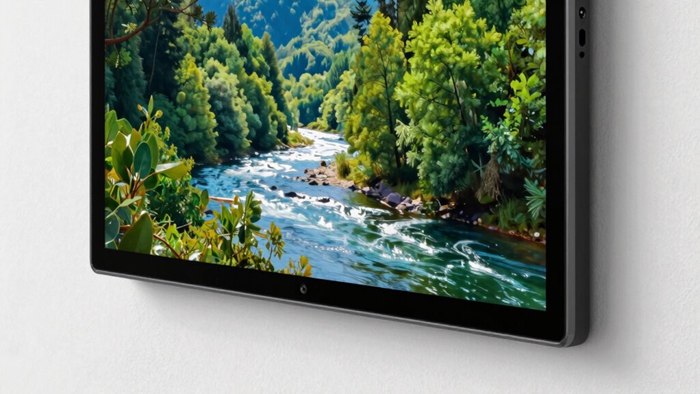
Digital art frames are revolutionizing how you display and enjoy artwork in your home or office. They offer a dynamic way to showcase a vast array of images, from classic paintings to contemporary photos, with the convenience of changing displays at a moment’s notice. But to truly make your art feel alive and authentic, paying attention to how the frame handles brightness and color is essential. Brightness isn’t just about making images visible; it’s about replicating the depth, vibrancy, and nuances of real-world art. If the brightness is too high or too low, even the most stunning image can look flat or washed out, diminishing its impact.
Proper brightness and color calibration bring your digital art to life with true vibrancy and depth.
One of the key factors in achieving a realistic display is proper display calibration. Calibration ensures that your digital art frame reproduces colors accurately, which is critical if you want your artwork to look true to life. Without calibration, colors may appear oversaturated, dull, or skewed, making the art look unnatural. When you calibrate your frame correctly, it aligns the device’s color output with industry standards, giving you confidence that what you see is what the artist intended. This process involves adjusting settings like contrast, brightness, and color balance, often through built-in calibration tools or by using calibration hardware and software. display calibration is also vital for maintaining color consistency over time, especially as ambient lighting conditions change.
Color accuracy plays a crucial role in this process. Accurate colors mean the shades, tones, and hues match those in the original artwork. This is especially important for art enthusiasts, photographers, or anyone who values fidelity in visual presentation. A well-calibrated display will show subtle color variations and details that might otherwise be lost or misrepresented, making the images more lifelike and emotionally impactful. When you combine precise display calibration with correct brightness settings, your digital art frame transforms into a window that faithfully reproduces the essence of the original piece.
Getting your frame properly calibrated might seem technical, but many modern digital art frames come equipped with user-friendly calibration tools. Some even offer automatic calibration features that simplify the process. Regularly adjusting your display’s brightness and color settings ensures your art remains vivid and true over time, especially as ambient lighting conditions change. Whether you’re viewing in a bright room or a dimly lit space, calibration helps maintain consistency and realism. Ultimately, investing time into proper calibration elevates your digital art experience, making your images look as stunning and genuine as possible.
Frequently Asked Questions
How Often Should I Recalibrate My Digital Art Frame?
You should recalibrate your digital art frame every few months to maintain color consistency and accurate brightness. If you notice the colors looking dull or off, it’s time for a quick calibration. Regular calibration guarantees your art always looks true to the original, especially if the ambient lighting changes or if you notice shifts in display quality. Staying on top of calibration keeps your art vibrant and realistic.
What Is the Best Lighting Environment for Viewing Digital Art?
Bright lighting can wash out digital art, so you should aim for a soft, ambient environment. Keep the color temperature warm or neutral to enhance the artwork’s vibrancy, reducing glare and reflections. Position the frame where viewing angles are ideal, avoiding direct sunlight or harsh lights that cause distortion. This setup guarantees your art remains vivid and true to the artist’s intent, making every viewing experience immersive and authentic.
Can Brightness Calibration Affect Color Accuracy?
Yes, brightness calibration can considerably affect color accuracy, ensuring color consistency and display uniformity across your digital art frame. When you calibrate brightness correctly, you help maintain true-to-life colors and prevent color shifts that distort the artwork. Proper calibration aligns the display’s brightness with ambient lighting, resulting in more accurate and consistent color reproduction, making your art look more realistic and vibrant, just as intended by the artist.
Are There Specific Settings for Different Types of Artwork?
You’ll find that adjusting calibration techniques for different types of artwork enhances their display. Think of it as dressing each piece in a tailored suit—vivid paintings might need brighter settings, while subtle sketches call for softer tones. By customizing brightness and color parameters, you guarantee each piece looks authentic and enthralling. So, yes, specific settings make a world of difference, turning your digital frame into a gallery that truly respects each artwork’s unique character.
How Do Ambient Light Changes Impact Calibration Over Time?
Ambient light fluctuations can cause calibration drift, impacting how your artwork appears over time. As ambient light changes throughout the day or seasons, your frame’s brightness settings might no longer match your artwork’s ideal display. To maintain accurate representation, regularly adjust the brightness or enable automatic calibration features if available. This helps guarantee your art always looks realistic, regardless of changing ambient conditions.
Conclusion
Think of your digital art frame as a window to another world. When brightness is just right, it’s like opening that window to a clear, sunlit day—everything looks real and alive. But if it’s too dim or too bright, it’s like peering through frosted glass or glaring sunlight. Calibrating your frame’s brightness is your key to transforming your space into a gallery that truly breathes with life, making every piece feel like it belongs.