Connect with us

Technical Analysis Skills

Understanding Scale and Proportion

For artists and designers, mastering scale and proportion is crucial, yet many overlook its impact—discover how these principles can transform your work.

Published

on

scale and proportion concepts

Understanding scale and proportion is essential for creating visually appealing art and design. Scale refers to the size of an object compared to others, while proportion deals with the size relationships within a single object. Proper use of these principles fosters harmony and balance, while mistakes can lead to awkward visuals. In art, scale can evoke powerful emotions, whether it's awe from large works or intimacy from smaller pieces. In design, mastering these concepts enhances usability and comfort. You'll discover even more insights on how to effectively apply scale and proportion in your own work.

Key Takeaways

  • Scale refers to the size of an object relative to others, while proportion relates to the size relationships among parts of a single object.
  • Effective use of scale and proportion creates visual harmony, balance, and directs the viewer's attention in art and design.
  • Larger elements within a composition typically attract more attention, while smaller details invite closer inspection and engagement.
  • The golden ratio is a mathematical principle that enhances visual harmony and balance in artistic and design compositions.
  • Misjudging scale and proportion can lead to awkward visuals and disjointed compositions, impacting the overall aesthetic and functionality.

Definition of Scale and Proportion

scale and proportion definition

Scale and proportion are fundamental concepts in art and design that shape how we perceive objects and their relationships. Scale refers to the size of an object in relation to others, while proportion deals with the relative sizes of different parts within a single object or composition.

When you think about proportion, consider the human body. It often serves as a standard for judging proportionality, with ideal proportions historically influenced by mathematical ratios, such as the golden ratio.

Using proportion effectively can evoke feelings of harmony and balance in your designs. Conversely, disproportionate elements can attract attention and create visual interest.

If you misjudge scale, though, you might distort perception, leading to confusion or misinterpretation of your artwork. Both scale and proportion are essential for establishing visual hierarchy, guiding viewers through your work, and enhancing its emotional impact.

Importance in Art

significance of artistic expression

When you look at a piece of art, the scale and proportion can hit you right in the emotions. A massive painting might leave you in awe, while a smaller work invites you to appreciate its intricate details.

Emotional Impact of Scale

Experiencing art often hinges on the emotional impact of its scale, which can profoundly alter how you perceive and connect with a piece. The size of an artwork influences your feelings, whether evoking awe or intimacy.

Advertisement

Here are some ways scale affects your experience:

  • Large-scale works create a sense of grandeur, dominating their surroundings, like the Great Wall of China.
  • Smaller artworks foster intimacy, inviting you to engage closely and appreciate intricate details, as seen in Persian miniature paintings.
  • Exaggerated scale enhances visual experience, drawing attention to specific details, similar to Chuck Close's photorealism.
  • Cultural significance often ties to scale, with large pieces like Hokusai's Great Wave embodying nature's power and shaping public perception.

Artists expertly manipulate scale and proportion to forge emotional connections. For instance, Michelangelo's David, towering over 13 feet, imposes a strong presence, while smaller pieces can create a profound sense of closeness.

Understanding how scale influences your emotional response can deepen your appreciation for art, leading to more meaningful connections.

Guiding Viewer's Eye

How do artists draw you into their work? They skillfully use scale and proportion to guide your eye and create a dynamic visual experience. By manipulating these elements, artists establish a focal point or emphasis that naturally captures your attention. For instance, larger elements in a composition often stand out, drawing you in and leading you on a journey through the artwork.

Proportion plays a critical role, too; it helps elements relate to each other, creating visual harmony that allows your gaze to flow smoothly across the piece. Many artists employ techniques like the golden ratio to achieve a balanced composition, enhancing your understanding of the work as you explore it.

On the other hand, disproportionate elements can introduce tension and intrigue. These unexpected sizes encourage you to investigate the artwork more thoroughly, as you navigate the contrasts and complexities of the piece.

Advertisement

Ultimately, the thoughtful use of scale and proportion not only enhances your visual experience but also deepens your engagement with the art, making every viewing an opportunity for connection and discovery.

Application in Design
design process integration application

When you design, scale and proportion are key to creating functional elements that enhance usability.

Properly applying these principles allows for a harmonious balance between different design elements, ensuring that each component complements the others effectively.

By establishing a clear visual hierarchy, you guide the viewer's attention, making it easier for them to navigate your space or product.

Understanding how these concepts work together can greatly improve your design outcomes, especially when considering creating an interior design mood board.

Functional Design Elements

Incorporating functional design elements is essential for creating spaces and products that truly meet users' needs. When you prioritize size and proportion in art, you enhance usability and comfort across various design fields.

Advertisement

For example, in modern farmhouse design, the use of natural materials and a neutral color palette can contribute to a harmonious atmosphere that feels inviting and spacious. Here are some critical aspects to take into account:

  • Architectural Design: Verify door heights and room sizes accommodate average human proportions for accessibility.
  • Graphic Design: Use the golden ratio to establish visual hierarchy, making headlines and images appropriately sized for maximum impact.
  • Product Design: Focus on ergonomic dimensions that fit comfortably in the hand, enhancing overall functionality.
  • Interior Design: Choose furniture dimensions that promote harmony and flow within a room, creating inviting spaces.

This is particularly important when evaluating key elements of modern farmhouse decor that emphasize comfort and practicality.

Visual Hierarchy Importance

Visual hierarchy is vital in design, as it directs the viewer's attention and shapes their experience. By manipulating scale and proportion, you can guide users to focus on the most important elements. Larger components naturally draw the eye, making them ideal as focal points. For instance, a bold headline immediately captures attention, while smaller text provides supporting details.

Additionally, just as guaranteeing wood stove safety standards is vital for preventing hazards, effective visual hierarchy guarantees that users engage with your design safely and intuitively.

Effective use of proportion helps establish relationships between design elements, creating a balanced composition that enhances readability. When you apply the golden ratio, you achieve aesthetically pleasing proportions, leading to a more harmonious layout. This balance is vital for user engagement—designs that feel cohesive invite exploration.

Scale differences also communicate importance and urgency. A large call-to-action button encourages interaction, signaling its significance in the overall design. In graphic design, maintaining consistent proportions across elements guarantees a cohesive visual narrative, reinforcing your brand identity and message clarity.

Advertisement

Ultimately, understanding visual hierarchy through scale and proportion empowers you to create designs that not only capture attention but also enhance user experience. Prioritize these principles, and you'll elevate your designs to effectively convey your intended message.

Techniques for Mastery
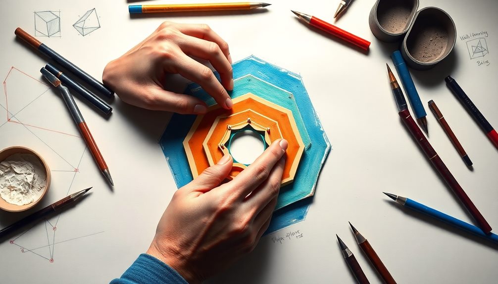
methods for achieving excellence

Mastering scale and proportion involves a blend of techniques that can greatly elevate your artistic endeavors. By applying these strategies, you'll create more compelling and harmonious compositions:

  • Use grids and guidelines to maintain consistent proportions.
  • Study classical artworks to understand historical approaches.
  • Experiment with sizes to explore emotional responses.
  • Apply the golden ratio to enhance visual harmony.

When you incorporate grids, you guarantee accurate scaling of images or objects, which helps you maintain relative size across your work.

Looking at Old Masters can inspire you and provide insights into effective scaling techniques. Don't shy away from experimentation—varying dimensions can considerably impact how viewers perceive your art.

The golden ratio, approximately 1.618, is a powerful tool that can create aesthetically pleasing proportions, guiding you toward balance in your compositions.

As you analyze successful designs from various disciplines, you'll refine your own techniques and develop a keen sense of how scale and proportion interact.

Common Mistakes

frequent errors in judgment

Common mistakes in scale and proportion can seriously undermine the effectiveness of your artwork. One of the most critical errors you might make is misjudging proportions. This can lead to unrealistic or awkward visuals that create discomfort or confusion for the viewer.

If elements don't relate properly, your composition may feel disjointed or chaotic, lacking the visual harmony necessary for an appealing piece.

Advertisement

Another common pitfall is overemphasizing one element, which disrupts the overall balance. This can make certain parts of your design appear overwhelming or out of place, throwing off the viewer's perception.

Relying solely on intuition without proper measurement can also lead to errors. You might overlook essential relationships between elements that need precise scaling and proportioning.

Understanding Scale

grasping proportional relationships

When you engage with the concept of scale, you'll find it plays a pivotal role in how your artwork communicates with viewers. Understanding scale is essential for creating a visual hierarchy and ensuring your message is clear. Here are some key points to contemplate:

  • Scale influences the emotional response of viewers.
  • Larger elements command more attention than smaller ones.
  • Exaggerated scales can symbolize significant concepts in public art.
  • Relative size comparisons enhance clarity and context.

By manipulating the size of objects in relation to one another, you can create focal points that guide the viewer's eye and enhance the overall composition.

For instance, a large sculpture can dominate a space, inviting people to engage more deeply with its meaning. In two-dimensional works, careful contemplation of scale can create the illusion of depth, making your piece more dynamic.

Ultimately, mastering scale helps you convey your artistic vision effectively. It's not just about making things look good; it's about ensuring that each element serves a purpose within the larger narrative of your work.

Exploring Proportion

analyzing ratios and relationships

Having explored the concept of scale, it's time to turn our attention to proportion, which plays an essential role in how elements interact within your artwork. Proportion assesses the size relationships among different components, helping you determine how they fit together in your composition.

You might find it helpful to reference the human body as a standard for judging proportion, as many artists do when aiming for realistic representations.

Advertisement

One renowned method for achieving pleasing proportions is the golden ratio, approximately 1.618. This ratio has been historically utilized in art and design to create balance and harmony. Correct proportions contribute to the overall aesthetic, while disproportionate elements can inject visual interest or tension, guiding the viewer's eye to specific areas.

You can perceive proportion in three ways: between parts of a single object, between an object and its environment, and among multiple objects viewed collectively.

Importance of Scale and Proportion

scale and proportion significance

The importance of scale and proportion in your artwork can't be overstated; they guide the viewer's eye and establish key focal points that enhance visual clarity. When you get these elements right, you not only create balance but also evoke emotional responses that resonate with your audience.

Consider these key points about scale and proportion:

  • Enhance Visual Clarity: Proper scale directs attention, making your message clearer.
  • Create Harmony: Correct proportions foster balance in your composition, while distorted ones can add interest or tension.
  • Impact Branding: Mastery of scale and proportion greatly influences how designs are perceived by consumers.
  • Guide Interpretation: These elements allow you to manipulate how viewers engage with the narrative of your artwork.

Inaccurate scale can lead to confusion, negatively impacting user engagement and retention of information.

When you understand the crucial role that scale and proportion play, you'll be better equipped to create compelling visuals that not only attract attention but also communicate effectively.

Applications in Various Fields

diverse utilization across disciplines

Scale and proportion play essential roles across various fields, influencing functionality and aesthetics in ways that directly impact user experience.

In architecture, these principles guarantee that spaces accommodate human movement and interaction, creating structures that are both visually appealing and practical.

Advertisement

When you explore graphic design, you'll find that effective visual hierarchies rely heavily on scale and proportion to guide the viewer's eye and enhance readability in both print and digital media.

Fashion design also utilizes these principles, enhancing garment appeal by guaranteeing clothing fits well and flatters the human form. This is particularly vital in tailoring and pattern making.

Similarly, in interior design, applying scale and proportion helps achieve harmonious spaces. You'll notice how balancing furniture sizes and placements creates functional flow while maintaining visual interest in a room.

Frequently Asked Questions

How to Explain Scale and Proportion?

To explain scale and proportion, you can use simple comparisons. Describe how sizes relate to each other and how different parts fit within a whole. Visual examples can make your explanation clearer and more engaging.

What Is an Example of Proportion and Scale in Art?

You can see proportion and scale in Michelangelo's David. Its towering height exaggerates the figure's heroism, while Hokusai's Great Wave contrasts massive waves with tiny boats, emphasizing nature's dominance and creating dramatic tension in the artwork.

Advertisement

What Is an Example of Scale, Proportion, and Quantity?

You can see scale in the towering Eiffel Tower, proportion in the Parthenon's golden ratio, and quantity in model train sets, where miniature elements represent larger systems, creating a cohesive visual experience in design.

How Do You Describe Proportion and Scale in Interior Design?

Picture a symphony where every instrument blends perfectly; that's proportion and scale in interior design. You balance furniture sizes, ensuring each piece speaks harmoniously, creating a space that feels inviting and effortlessly functional for your lifestyle.

Conclusion

In summary, grasping scale and proportion is essential for creating visually appealing works in art and design. Did you know that nearly 70% of people find artwork more engaging when the proportions are balanced? By mastering these concepts, you not only enhance your creations but also connect better with your audience. So, keep experimenting with scale and proportion, and watch how your work transforms into something truly enchanting!

Advertisement

Technical Analysis Skills

Understanding Visual Balance

With the right understanding of visual balance, your designs can captivate audiences—discover the secrets to achieving harmony in your compositions.

Published

on

achieving aesthetic harmony visually

Understanding visual balance is key to creating designs that resonate. It refers to how visual weight is distributed across your composition, affecting viewer perception. You can achieve balance through symmetry, asymmetry, or radial arrangements, each influencing the harmony of your design. Balanced elements draw attention and enhance comfort, allowing your message to shine. Be mindful of scale and color, as these factors impact balance. Watch out for common mistakes like overcrowding, which can disrupt harmony. By exploring various techniques and principles, you'll uncover strategies for crafting visually compelling work that captures attention.

Key Takeaways

  • Visual balance is the distribution of visual weight in a composition, creating harmony and stability for effective communication.
  • Types of visual balance include symmetrical, asymmetrical, radial, mosaic, and discordant, each impacting viewer perception differently.
  • Techniques for achieving balance involve establishing focal points, using contrasting colors, adjusting scales, and incorporating negative space.
  • Balanced designs enhance aesthetic appeal, guiding viewer attention and improving retention of key information.
  • Common design mistakes include overcrowding, neglecting negative space, and lacking clear focal points, which disrupt visual balance.

Definition of Visual Balance

equilibrium in visual composition

Visual balance is the distribution of visual weight in a composition, creating harmony and stability. It's not just about symmetry; balance in graphic design can also be asymmetrical.

When you arrange design elements, you must consider their perceived weight, influenced by factors like size, color, texture, and position. For example, a large, dark element can feel heavier than a small, light one, even if they occupy the same space.

Understanding visual balance is essential for effective communication in design. Balanced compositions engage viewers, making them feel comfortable and drawn to your message. If you create an imbalance, it can lead to discomfort and distract from the intended message.

Different types of balance exist, including symmetrical, asymmetrical, radial, mosaic, and discordant balance. Each type serves different purposes and elicits unique responses from the audience.

Importance of Visual Balance

achieving aesthetic harmony visually

Visual balance is essential for achieving aesthetic appeal and effective communication in your designs.

When elements are well-balanced, they create a sense of harmony that draws viewers in and keeps their attention focused on your message.

Advertisement

Without this balance, your design can become overwhelming or confusing, undermining its impact.

Aesthetic Appeal

A well-balanced composition not only captures attention but also enhances the overall aesthetic appeal of a design. When you achieve visual balance, it creates an inviting atmosphere that encourages viewers to engage with your content.

Here are four key benefits of incorporating balance into your designs:

  1. Easier Processing: Balanced compositions are more aesthetically pleasing, allowing viewers to process information quickly.
  2. Guided Focus: Visual balance helps direct the viewer's eye toward essential elements, reinforcing your focal point.
  3. Increased Retention: Research shows that designs with visual balance can boost viewer retention and satisfaction, creating a memorable experience.
  4. Emotional Engagement: Aesthetic appeal derived from balance evokes positive emotions, fostering trust and professionalism in branding.

Effective Communication

Effective communication relies heavily on how well design elements are balanced within a composition. Visual balance enhances your ability to convey messages, ensuring that the distribution of elements guides the viewer's eye toward key information.

When you create a balanced composition, you foster viewer comfort and engagement, making it easier for your audience to process information and focus on what truly matters. Embracing design thinking principles can further refine your approach to visual balance, allowing for a deeper understanding of user needs and preferences through iterative prototyping.

Understanding visual weight is essential—it's influenced by size, color, and texture. By effectively managing these elements, you can direct attention and convey hierarchy within your design. A well-balanced layout creates a sense of professionalism and credibility, which is vital for building trust in branding and advertising contexts.

Advertisement

Moreover, effective communication through visual balance can greatly improve user experience in web design. When visitors can navigate your site easily, interaction rates increase, and they're more likely to retain important information.

Incorporating design fundamentals to achieve visual balance not only enhances your message but also elevates the overall impact of your work, ensuring that your audience engages with your content meaningfully.

Types of Visual Balance

symmetrical and asymmetrical balance

Five distinct types of visual balance can shape your design work, each offering a unique approach to composition. Understanding these balances will help you create engaging and harmonious designs.

  1. Symmetrical Balance: This involves an equal distribution of visual weight on both sides of a central axis, creating harmony and stability, often seen in traditional designs.
  2. Asymmetrical Balance: Here, you utilize different visual weights to create a dynamic composition. This approach feels stable despite lacking symmetry, engaging viewers through contrast and movement.
  3. Radial Balance: In this type, you arrange elements around a central point. This design draws the eye toward the center, often found in natural and cultural patterns.
  4. Mosaic Balance: This creates a cohesive whole from various elements of differing sizes and weights. It results in organized chaos that maintains visual interest, even without a clear focal point.

Techniques for Achieving Balance

methods for attaining equilibrium

Achieving visual balance in your design involves several key techniques that can elevate your work. Start by establishing strong focal points; they guide viewer attention and create a sense of hierarchy, enhancing overall balance.

Use contrasting colors to add visual interest—distribute lighter and darker shades effectively throughout the composition to maintain equilibrium.

Next, adjust the scale and proportion of elements. This helps guarantee a harmonious distribution of visual weight, contributing to a cohesive design that feels stable.

Don't forget about negative space; incorporating empty areas strategically enhances your overall composition and prevents overcrowding, which can disrupt balance.

Advertisement

Additionally, repeat design elements like shapes or colors to create rhythm and unity within your work. This repetition not only reinforces your central theme but also enhances asymmetrical balance, making your design feel intentional and complete.

By employing these techniques, you'll create a visually appealing composition that captures attention and communicates effectively.

Practical Applications of Balance

balance in everyday life

Visual balance plays an essential role in various design fields, influencing everything from branding to web layouts. When you achieve effective visual balance, you're not just creating appealing designs; you're enhancing functionality and engagement. Here are some practical applications of balance:

  1. Branding: Logos that feature symmetry convey stability and professionalism, helping to build recognition and trust. Additionally, similar principles can be applied to the role of color accuracy in home cinema projectors, ensuring that the visual elements are harmonized for a more impactful design.
  2. Web Design: A balanced layout improves user experience, guiding visitors through content and making navigation seamless.
  3. Advertising: Visually balanced graphics capture attention and communicate messages effectively, leading to higher engagement rates.
  4. Photography: Thoughtful arrangement of subjects and negative space creates impactful images that keep viewer interest.

Incorporating both symmetry and asymmetry allows you to harmonize elements in a design, evoking specific emotions and telling compelling stories.

Whether you're designing a logo or crafting an advertisement, focusing on visually balanced compositions will elevate your work. Remember that the goal is to create an experience that feels intuitive and inviting.

Common Mistakes in Design

designing without user feedback

Even with a solid understanding of balance, designers often stumble into common pitfalls that can undermine their work. One major mistake is overcrowding the design with excessive elements, which confuses viewers and disrupts visual balance. When you ignore scale relationships, you can create a chaotic composition where weight feels uneven.

It's vital to think about how various elements interact within a space; for instance, incorporating smart lighting can enhance the overall aesthetic without overwhelming the viewer.

Neglecting negative space is another common error. Without utilizing empty areas effectively, your design can appear cluttered and lose its impact.

Advertisement

Additionally, mixing inconsistent styles can create a lack of cohesion, leading to imbalance that confuses the message.

An important aspect of effective design is having a clear focal point. If your composition lacks this, it can feel disjointed, making it difficult for viewers to navigate and engage with your work.

Asymmetrical balance can be powerful, but without a defined focal point, the design may lose its intended effect.

Exploring Gestalt Principles

understanding visual perception concepts

Harmony in design often hinges on understanding how the human brain processes visual information, which is where Gestalt principles come into play. These principles emphasize that you perceive whole forms rather than just the sum of their parts, greatly influencing visual balance in your designs.

Here are four key principles to take into account:

  1. Proximity: Group elements close together to create relationships and guide viewers' attention.
  2. Similarity: Use similar shapes or colors to help establish cohesion and balance around your composition.
  3. Closure: Allow viewers to fill in gaps, making the design feel complete and engaging.
  4. Figure-Ground Relationship: Clearly distinguish the subject from the background to establish a focal point and enhance visual balance.

Additionally, the law of symmetry suggests that symmetrical arrangements are often perceived as more balanced and harmonious.

By understanding and applying these Gestalt principles, you can intentionally manipulate visual weight and organization, fostering dynamic compositions that resonate with your audience.

Advertisement

Mastering these types of visual strategies will elevate your design work and guarantee it captures and retains viewers' attention effectively.

Resources for Further Learning

additional learning materials available

To enhance your understanding of visual balance, check out some recommended reading materials that focus on design principles.

You can also enroll in online courses that offer practical insights and hands-on experience.

Don't forget to engage with design communities, where you can share ideas and receive valuable feedback on your projects.

Recommended Reading Materials

As you dive deeper into the concept of visual balance, you'll find a wealth of resources that can enhance your understanding and skills.

To truly grasp the five types of balance—symmetrical and asymmetrical—you should explore various materials that illustrate these principles.

Advertisement

Here are some recommended reading materials:

  1. Books on Design Principles: Look for titles focusing on visual balance, discussing how it enhances aesthetic appeal and viewer engagement.
  2. Case Studies: Review successful branding and advertising campaigns that effectively utilize visual balance, providing real-world examples of asymmetrical balance.
  3. Design Journals and Articles: These often highlight different types of balance in various mediums, offering practical insights into how to achieve balance.
  4. Community Forums: Engage with design professionals who share critiques and insights on visual balance. This interaction can refine your skills and understanding.

Online Courses Available

Mastering visual balance is essential for any designer looking to elevate their work. Online courses can be a fantastic way to deepen your understanding of the principles of design, including symmetrical, asymmetrical balance, and radial balance. These courses often feature hands-on projects, enabling you to apply balance techniques in real-world scenarios.

In these courses, you'll have access to experienced instructors who provide personalized feedback on your design work. This feedback is invaluable as you learn to manage visual weight and utilize color theory effectively. Additionally, many courses come with supportive resources like video tutorials, reading materials, and forums where you can collaborate with peers.

Here's a quick overview of what to expect from online courses on visual balance:

Course Aspect Benefits Key Focus Areas
Personalized Feedback Tailored guidance on designs Asymmetrical balance
Hands-on Projects Apply techniques practically Visual weight management
Community Support Collaboration with peers Principles of design

Engaging in these online courses will not only enhance your skills but also help you create more visually balanced designs.

Design Community Engagement

Engaging with design communities can greatly enhance your learning experience and provide valuable insights into visual balance. By connecting with others in the field, you can gain feedback, collaborate on projects, and stay updated on best practices.

Advertisement

Here are four ways to immerse yourself in design community engagement:

  1. Participate in Design Workshops: These hands-on experiences allow you to explore visual balance through practical applications and learn the latest techniques from experts.
  2. Join Online Forums and Social Media Groups: Share your work and seek feedback from experienced designers. This exchange fosters a supportive environment and encourages growth.
  3. Subscribe to Design Newsletters: Keep yourself informed about new resources, articles, and best practices related to achieving balance in design.
  4. Engage in Design Challenges: Collaborating with peers on these challenges promotes experimentation and helps you learn from one another's ideas.

Additionally, exploring resources like Alvalyn Lundgren's insights on brand strategy can deepen your understanding of visual balance.

Frequently Asked Questions

How Do You Explain Visual Balance?

Visual balance is all about distributing visual weight in your designs. You achieve this through color, size, and positioning, ensuring elements interact harmoniously. It helps create visually appealing compositions that engage and comfort viewers.

What Are the Three Types of Visual Balance?

You'll find three main types of visual balance: symmetrical, where elements mirror each other; asymmetrical, which balances differently sized elements; and radial, where components radiate from a central point, creating harmony in design.

What Are the 5 Principles of Balance?

Picture a perfectly balanced scale. You've got symmetrical, asymmetrical, radial, mosaic, and discordant balance. Each principle dances with visual weight, creating harmony or disruption, guiding your design choices to captivate and engage your audience effectively.

How Does Visual Balance Make You Feel?

When you see a well-balanced design, you feel a sense of calm and comfort. It draws you in, making you more engaged and open to the message, enhancing your overall experience with the composition.

Advertisement

Conclusion

In understanding visual balance, you've revealed the secret to creating designs that captivate and engage like a thousand fireworks lighting up the night sky. By applying the techniques and principles discussed, you can transform your work into a harmonious masterpiece that draws the viewer in. Remember, avoiding common pitfalls is just as essential for achieving that perfect equilibrium. With these tools, you're ready to elevate your designs to new heights and make an unforgettable impact!

Continue Reading

Technical Analysis Skills

Reading Symbolism in Artwork

By delving into the symbolism of artwork, you can uncover hidden emotions and meanings that invite deeper exploration of the artist’s intent.

Published

on

interpreting art s deeper meaning

To interpret symbolism in artwork, focus on the emotions and deeper meanings conveyed by the artist. Each symbol often carries personal significance and can vary widely in interpretation. Look for recognizable forms that might evoke familiar feelings, complemented by specific colors that enhance mood—like blue for calm or red for passion. Artists like Klimt and Munch used these techniques to explore profound themes such as love or existential angst. By considering the historical and cultural context, you can uncover richer insights and appreciate the emotional layers in art. Continue exploring to enhance your understanding of these enchanting nuances.

Key Takeaways

  • Understand that Symbolism prioritizes emotional expression over realistic representation, inviting personal interpretations of artwork.
  • Recognize that colors play a crucial role, with specific hues evoking distinct feelings and enhancing symbolic meanings.
  • Analyze the use of recognizable forms alongside dreamlike imagery, which allows for deeper exploration of emotional landscapes.
  • Consider the historical and cultural context, as it informs the meanings and significance of symbols within the artwork.
  • Reflect on the artist's intent and personal experiences, as these shape the integration of symbols and their emotional impact.

Understanding Symbolism in Art

interpreting artistic symbolism meaning

Exploring the world of Symbolism in art reveals a fascinating departure from the constraints of realism and naturalism. Instead of depicting the physical world, Symbolist artists like Gustav Klimt and Edvard Munch create a visual language that evokes emotions and suggests deeper meanings. By using recognizable forms and muted colors, they investigate complex themes such as love, death, and spirituality, inviting you to engage with their works on an emotional level.

Understanding symbolism in art requires you to look beyond the surface. Each symbol carries specific meanings that are often deeply personal to the artist, making your interpretation unique. Unlike more universal themes found in other art movements, Symbolism focuses on the subjective experience, emphasizing the thoughts and sensations that arise from the artwork.

As you explore these dreamlike images and allegorical themes, you'll discover how color and form can convey emotions that reflect the human experience. Recognizing these symbols and their meanings allows you to appreciate the rich tapestry of ideas that Symbolist artists sought to express.

Key Characteristics of Symbolist Art

emotional expression through symbolism

Symbolist art stands out for its unique blend of recognizable forms and dreamlike imagery, inviting viewers to explore a world of emotion and meaning. This movement emphasizes a deeper connection to life's larger themes, using symbolism to convey complex ideas rather than just emotions.

Here are four key characteristics of Symbolist art:

  1. Recognizable Forms: While it incorporates dreamlike imagery, you'll notice that Symbolist art often maintains identifiable shapes, allowing for personal interpretation.
  2. Muted Colors: The use of subdued color palettes creates an atmosphere of introspection and mystery, enhancing the artwork's emotional depth.
  3. Mythological Elements: Artists frequently draw from classical influences, weaving mythological and spiritual themes into their work, which adds layers of symbolic meaning.
  4. Distorted Figures: Expect to see figures that may appear altered or exaggerated, evoking a sense of the fantastical, and prompting you to investigate deeper into their implications.

Through these characteristics, Symbolist art distinguishes itself from other movements, guiding you to engage with its profound meaning and explore the emotional landscapes it portrays.

Influential Symbolist Artists

impactful symbolist art movement

Several influential artists shaped the Symbolist movement, each contributing unique perspectives and techniques that enriched its emotional and thematic complexity.

Gustave Klimt, for instance, is renowned for his sensual subjects and innovative use of gold foil. His iconic work, *The Kiss*, exemplifies the emotional depth typical of Symbolist art, where he masterfully used symbols to convey intimacy and connection.

Advertisement

Edvard Munch explored darker themes like death and human struggle, with *The Scream* serving as a powerful representation of existential angst and emotional turmoil, reacting against realism to explore deeper psychological states.

Odilon Redon focused on dreams and fantasy, often drawing inspiration from literature; his work *Pegasus* reflects a fascination with the subconscious and surreal imagery.

Gustave Moreau, celebrated for intricate compositions, often incorporated mythological themes, as seen in *Oedipus and the Sphinx*, highlighting the Symbolist emphasis on allegory and emotional expression.

Analyzing Symbols in Context

symbols analyzed within context

Understanding the rich tapestry of symbols in artwork requires a keen eye for the cultural and historical contexts surrounding each piece. The meaning of symbols can shift dramatically based on various factors, reminding us that art isn't created in a vacuum.

For instance, the cross in Western art often signifies Christianity, while in other societies, it may represent the four cardinal points. This diversity illustrates how symbols can be layered with meanings.

When analyzing symbols, consider these key points:

Advertisement
  1. Cultural Significance: Symbols often depict beliefs and values of a specific culture.
  2. Historical Context: Understanding when a piece was created can reveal reactions against realism and naturalism.
  3. Artist's Intent: Artists' personal experiences shape how symbols are integrated into their work.
  4. Emotional Impact: Symbolist art, for example, often employs symbols to evoke emotions and suggest deeper realities.

The Role of Color in Symbolism

color s symbolic significance explored

Color plays an essential role in conveying emotion and meaning in artwork, particularly in Symbolism. By using specific hues, artists can spark the viewers' emotions and invite them to explore deeper themes. For instance, blue often symbolizes calmness and truth, while red conveys passion and strength. In Gustav Klimt's *The Kiss*, the use of gold creates an opulent atmosphere, enhancing the sensuality of the subjects.

Symbolist artists like Edvard Munch utilized contrasting colors in works such as *The Scream* to illustrate despair and anxiety, emphasizing the emotional turmoil of the human experience. Green frequently represents nature and life, highlighting growth and vibrancy, which resonates with themes of renewal and the cyclical nature of existence.

The interplay of light and shadow, along with the carefully chosen color palette, contributes to the dreamlike qualities of these compositions. Each color's cultural and psychological meanings enrich the viewer's understanding, bridging the gap between the physical world and the emotional landscape.

As you engage with these pieces, remember that every choice made by the artist serves a purpose, allowing you to appreciate the layers of meaning within the oil on canvas. Rights reserved.

Frequently Asked Questions

How to Understand Symbolism in Art?

To understand symbolism in art, you'll want to explore historical context, analyze colors and motifs, and consider the emotional tone. Look into the artist's background, as their intentions often reveal deeper meanings behind the symbols.

What Are Examples of Symbolism in Art?

You can find symbolism in various artworks. For instance, Klimt's gold leaf in *The Kiss* represents love, while Munch's vibrant colors in *The Scream* convey emotional turmoil, showcasing the depth of human experiences.

Advertisement

What Is Reading Symbolism?

When you read symbolism, you decode hidden meanings behind images and objects. It's like deciphering an ancient text, revealing deeper insights and emotions that enrich your understanding of the artist's intent and cultural context.

What Is the Study of Symbolism in Art?

The study of symbolism in art explores how artists convey deeper meanings through symbols. You'll analyze images, consider cultural contexts, and uncover emotional responses, revealing personal and universal interpretations that enrich your understanding of their work.

Conclusion

To sum up, diving into symbolism in art enriches your appreciation and understanding of the piece. For example, consider Edvard Munch's "The Scream." The swirling colors and distorted figure symbolize existential dread and anxiety. By recognizing these symbols, you connect more deeply with the emotions behind the artwork. So next time you view a piece, look beyond the surface—each brushstroke might tell a story waiting for you to uncover!

Continue Reading

Technical Analysis Skills

How to Analyze Abstract Art

Analyze abstract art by exploring shapes, colors, and emotions, and discover how your unique interpretation can transform your experience of the artwork.

Published

on

understanding abstract art techniques

To analyze abstract art, focus on the shapes, colors, and forms that break from reality. Pay attention to how these elements evoke emotions. Embrace the subjective nature of the artwork—your interpretation matters. Look for balance between positive and negative space, and observe the composition's dynamics. Consider how color influences your feelings and how light affects the artwork's perception. Engage with the piece as if you're listening to music, letting your emotions guide you. This approach will enrich your connection. There's plenty more to explore about techniques and artists that can enhance your understanding even further.

Key Takeaways

  • Focus on core elements like color, line, shape, and texture to understand the artwork's emotional impact and composition.
  • Engage emotionally with the piece, allowing personal interpretations to enhance your viewing experience and connection to the art.
  • Observe the balance between positive and negative space, as it defines harmony and influences overall composition.
  • Consider the artist's techniques, such as use of light, shadow, and texture, to uncover deeper meanings and emotional expressions.
  • Explore the emotional associations of colors used in the artwork, as they significantly shape interpretation and viewer experience.

Understanding Abstract Art

interpreting non representational art

When plunging into abstract art, you'll find it's all about shapes, colors, and forms that stray from reality, inviting you to engage on a personal level. Understanding abstract art requires an open mind and a willingness to explore beyond traditional interpretations.

This art form encourages you to immerse yourself in your emotional experience, allowing the artwork to resonate with your feelings and thoughts.

As you analyze abstract pieces, consider key elements like color, line, shape, texture, and spatial relationships. Each component contributes to the overall emotional experience and can evoke different responses. For instance, vibrant colors may spark joy or excitement, while darker tones might invoke feelings of sadness or contemplation.

Don't forget that the context in which you view the artwork plays a significant role in shaping your perception. The environment and even the time of day can alter your emotional response, adding layers to your interpretation.

While understanding the artist's background and intentions can enhance your appreciation, it's not essential for you to enjoy abstract art. Instead, allow your personal interpretations to guide your experience, making it uniquely yours.

Advertisement

Subjectivity in Interpretation

interpretation s subjective nature

While engaging with abstract art, you'll quickly notice that its beauty lies in the subjectivity of interpretation. Unlike traditional art forms, abstract art lacks definitive meanings, allowing you to derive personal interpretations shaped by your own emotional responses and experiences. This subjectivity in interpretation is an essential characteristic of abstraction, encouraging a rich tapestry of viewpoints and reactions from different viewers.

Your emotional involvement plays a significant role in how you perceive and connect with these works. Rather than searching for literal narratives or specific meanings, you can embrace the ambiguity that abstract art offers. This approach not only enhances your viewing experience but also deepens your engagement with the artwork.

While familiarity with an artist's background and intentions can enrich your appreciation, it isn't necessary for understanding the emotional tone of the piece. Instead, focus on how the artwork makes you feel, allowing your personal experiences to guide your interpretation.

Techniques for Viewing

methods for visual analysis

When you view abstract art, approach it like you're listening to a symphony, letting the overall experience wash over you.

Explore the visual composition by paying attention to details like color and texture, but don't forget to step back and appreciate the piece as a whole.

Engage your emotions as you reflect on what the artwork stirs within you, allowing your personal interpretations to shape your understanding.

Emotional Engagement Techniques

To truly connect with abstract art, you need to immerse yourself in the experience, much like you'd with an enchanting piece of music. Approach the artwork with an open mind, letting your eyes and thoughts roam freely. Instead of searching for a literal meaning, focus on the emotional experience that colors, lines, shapes, and textures evoke within you.

Advertisement

Spend time observing the piece, as personal engagement can lead to varied emotional reactions. Notice how different elements interact—balance between positive and negative space, along with the use of light and shadow, plays an essential role in shaping your understanding.

Allow yourself to embrace ambiguity; abstract art often thrives on open-ended interpretation. Recognize that your unique emotional response contributes to the artwork's meaning, making it a deeply personal experience.

As you engage with the piece, don't rush. Let each glance linger, allowing your feelings and thoughts to evolve. By doing so, you'll cultivate a richer relationship with the artwork, enhancing both your appreciation and understanding of its emotional depth.

Visual Composition Exploration

As you explore abstract art, consider the composition as a dynamic symphony, where colors, shapes, and lines harmonize to create an immersive experience. Your visual composition exploration begins with observing the artwork as a whole.

Allow your eyes to dance over the piece, noting how elements interact. Pay special attention to negative space; it's essential for defining objects and creating balance. Reflect on the emotional impact of color and texture, as these choices can provoke strong feelings.

Advertisement

To deepen your understanding of abstract art, keep these techniques in mind:

  • Experiment with various viewing angles to reveal hidden textures and brushstrokes.
  • Observe the balance between detailed observations and the overall composition.
  • Reflect on how the interplay of colors and shapes affects your emotions.
  • Take a moment to step back and appreciate the artwork as a unified whole.

Influential Art Movements

transformative artistic trends emerge

When you explore influential art movements, you can't overlook Cubism and Abstract Expressionism.

Cubism breaks objects down into geometric shapes, forcing you to see them from multiple angles, while Abstract Expressionism prioritizes raw emotion through dynamic brushwork.

Understanding these key characteristics can greatly enhance your appreciation of abstract art.

Key Characteristics of Cubism

Cubism, at its core, revolutionizes how you perceive and interpret art by breaking down subjects into geometric shapes and presenting multiple perspectives simultaneously. Pioneered by artists like Pablo Picasso and Georges Braque, this movement emphasizes the flatness of the canvas, often using muted color palettes to draw your attention to form rather than color.

Key characteristics of Cubism include:

Advertisement
  • Fragmentation: Objects are deconstructed into facets, creating a dynamic visual experience.
  • Multiple Perspectives: You'll notice various angles presented in a single painting, inviting you to explore the artwork from different viewpoints.
  • Analytic vs. Synthetic: Analytic Cubism focuses on deconstructing subjects, while Synthetic Cubism introduces collage elements and brighter colors.
  • Influence on Modern Art: This movement laid the groundwork for styles like Abstract Expressionism and Surrealism, shaping the future of abstract art.

As you analyze Cubist paintings, pay attention to how the artists challenge traditional representation and engage you in a deeper dialogue about perception and reality.

Understanding these characteristics will enhance your appreciation of this groundbreaking movement.

Emotional Expression in Abstract Expressionism

Abstract Expressionism's emotional expression stands out as a powerful force in the art world, inviting viewers to connect deeply with the artist's inner feelings. Emerging in the 1940s and 1950s, this movement is marked by spontaneous, gestural brushstrokes that reflect emotional intensity.

Artists like Jackson Pollock and Willem de Kooning led the charge, using techniques that emphasized the creative process itself. Pollock's drip painting, for instance, involved pouring and splattering paint on large canvases, allowing for an immersive interaction that draws you into the chaos of his emotions.

In Abstract Expressionism, the act of painting becomes an emotional release, with color and form serving as the primary vehicles for conveying mood. Mark Rothko's use of color fields evokes profound feelings, prompting introspection in viewers like you.

This movement rejects traditional representation, focusing on the essence of emotion rather than recognizable subjects. Its roots in German Expressionism and Surrealism further emphasize the exploration of the unconscious mind, enabling artists to tap into both personal and collective emotional experiences.

Advertisement

Key Artists to Explore

discover notable creative talents

Who are the artists that have shaped the landscape of abstract art? Delving into the works of key artists to explore can deepen your understanding and appreciation of this dynamic form. Each artist brings a unique perspective, showcasing how abstract art is open to interpretation.

  • Wassily Kandinsky: A pioneer of abstract art, he believed colors and shapes could express profound emotions without depicting real objects.
  • Piet Mondrian: Known for his geometric abstraction, he focused on primary colors and a grid structure, balancing form and color to evoke harmony.
  • Jackson Pollock: Famous for his drip painting technique, Pollock emphasized spontaneity and the emotional intensity of the act of painting itself.
  • Kazimir Malevich: He introduced Suprematism, prioritizing pure geometric forms and limited colors to evoke spiritual transcendence.

Additionally, Georgia O'Keeffe explored natural forms and color interplay, creating large-scale flower paintings that foster a connection with nature.

Elements of Composition

fundamental components of design

Understanding the works of key artists lays a strong foundation for exploring how they construct their pieces. In abstract art, composition is central to creating a cohesive piece. It involves the thoughtful arrangement of visual elements like line, shape, and texture to guide the viewer's experience.

Balance between positive and negative space is essential. It defines objects and contributes to the overall harmony of the artwork. You'll often see how artists create focal points through the strategic placement of elements, directing your eye and instilling a sense of movement.

Texture plays an important role in this composition, enhancing coherence and adding depth. When artists maintain texture consistency throughout their work, it allows for a more immersive interaction.

As you analyze a piece, pay attention to how these elements come together. Notice how the texture interacts with shapes and lines, and how the overall composition influences your emotional response.

The Role of Color

impact of color psychology

Color plays an essential role in abstract art, serving as a powerful tool to evoke emotions and convey meaning. Each hue can trigger specific feelings, guiding you through the artist's emotional landscape. For instance, blue often represents calmness, while red might ignite passion and intensity.

Artists like Yves Klein have famously used pure color to challenge conventional art, encouraging you to explore your own emotional responses.

When analyzing the role of color, consider these key points:

Advertisement
  • Emotional Associations: Different colors can symbolize various emotions, impacting your interpretation.
  • Color Palettes: The artist's choice of colors can create harmony or tension, shaping your emotional journey.
  • Psychological Effects: Understanding color psychology helps you connect personal experiences and cultural contexts with the artwork.
  • Contrast and Depth: The use of contrasting colors adds dynamic interest, enriching the overall composition and enhancing your engagement.

Engaging With Abstract Art

exploring abstract art concepts

Engaging with abstract art can be a transformative experience, allowing you to connect deeply with the artwork on an emotional level. Instead of searching for literal meanings or recognizable subjects, immerse yourself in the overall emotional impact.

Pay attention to the elements of color, line, shape, and texture, as these significant components shape your perception and feelings about the piece. Trust your intuition as you explore the artwork. Let your personal feelings guide your interpretation, knowing that abstract art is crafted to provoke thought and evoke unique emotional responses.

Spending time in front of a piece can further enhance your connection, revealing layers of meaning and emotion that may not be immediately apparent. Consider the context in which the artist created the work. Understanding the artist's background and intent can provide valuable insights that enrich your viewing experience.

Analyzing Artistic Techniques

exploring creative expression methods

When you look at abstract art, the techniques an artist employs can reveal much about their emotional expression and intentions. By analyzing these artistic techniques, you can gain deeper insights into the piece. Start by examining the use of color, shape, line, and texture, as these elements markedly influence the overall composition.

Consider these points as you analyze abstract paintings:

  • Balance and tension: Notice how the arrangement of elements creates a sense of harmony or conflict, impacting your emotional response.
  • Negative space: Pay attention to the areas around the positive forms; they play an essential role in defining the artwork's overall composition.
  • Light and shadow: Observe how these interact within the piece, highlighting three-dimensional aspects and altering your perception.
  • Texture consistency: Evaluate the variations in texture throughout the artwork; they can create visual interest and enhance coherence.

Maintaining Your Art Collection

caring for artworks properly

To keep your art collection in top shape, you need to focus on proper storage and regular maintenance.

Inspect each piece for any signs of wear, and make certain you're using suitable materials for framing to protect your investments.

Proper Storage Techniques

Properly storing your abstract art is essential for preserving its beauty and integrity over time. To guarantee that your collection remains in pristine condition, follow these proper storage techniques:

Advertisement
  • Climate Control: Store your artworks in a climate-controlled environment with stable temperature and humidity levels to prevent damage and deterioration.
  • Acid-Free Materials: Use acid-free tissue paper or cardboard for wrapping and interleaving artworks to avoid harmful chemical reactions.
  • Avoid Sunlight: Keep your abstract paintings away from direct sunlight, as UV rays can fade colors and damage the materials used.
  • Stacking Safely: When stacking multiple pieces, place them on flat surfaces and avoid heavy items on top to prevent creasing or warping.

Regularly inspect your stored artworks for signs of mold, dust, or damage. If you notice any issues, clean them gently using appropriate methods to maintain their condition.

Regular Maintenance Practices

Maintaining your abstract art collection involves regular inspections and proactive care to guarantee each piece remains in excellent condition. Start by regularly checking for any signs of damage or deterioration.

Make certain your artworks are stored or displayed in environments with controlled temperature and humidity to prevent warping or mold growth. Avoid direct sunlight exposure, as UV rays can fade colors and damage the canvas over time. Consider using UV-filtering glass for framed pieces to protect them.

For oil paintings, dust the surface gently with a soft, dry cloth or a microfiber duster to prevent dirt accumulation; never use water or cleaning solutions directly on the artwork. When storing unstretched canvases, keep them rolled in acid-free paper or fabric to protect against scratches and light exposure.

Properly framing stretched canvases for display will help prevent damage to the edges. Lastly, for significant restoration needs or long-term care advice, consider consulting a professional conservator.

Assessing Art Value

Understanding the value of your abstract art collection is just as important as maintaining its physical integrity. When evaluating art value, consider both the tangible and intangible factors that contribute to the worth of your pieces. The meaning behind each artwork can enhance its appeal, but proper care guarantees its longevity and market value.

Advertisement

To effectively evaluate and maintain your art collection, keep these points in mind:

  • Regularly check the condition of your original prints and store them properly to prevent deterioration.
  • Confirm canvases are stretched correctly and framed appropriately to preserve their condition.
  • Be aware that rarity and authenticity, especially for signed and numbered works, can greatly boost market value compared to reproductions.
  • Maintain an updated inventory, including provenance and condition reports, to track and manage your collection's value.

Frequently Asked Questions

How Do You Analyze Abstract Art?

To analyze abstract art, you'll explore its fundamental elements like color and shape, reflect on your emotional response, consider the use of space, and examine the techniques and materials that create its unique impact.

What Are the 5 Main Characteristics of Abstract Art?

Abstract art's five main characteristics are vibrant colors, unique shapes, dynamic lines, varying textures, and the use of negative space. These elements combine to evoke emotions and invite personal interpretations, enhancing your viewing experience.

How to Tell if Abstract Art Is Good?

To tell if abstract art is good, look for emotional impact, cohesive composition, and innovative techniques. If the piece evokes feelings and engages your mind, it's likely to be a strong work of art.

How Do You Explain Abstract Art?

Think of abstract art as a conversation without words. You explain it by describing how colors and shapes resonate with you, inviting others to share their feelings, creating a unique dialogue that's personal and open-ended.

Conclusion

As you step back from your exploration of abstract art, remember that like a puzzle, each piece holds a unique story waiting to be uncovered. Embrace the chaos and let your imagination dance among the colors and forms, much like a child wandering through a whimsical wonderland. By engaging with these works, you not only enrich your own understanding but also connect with the boundless creativity of the artists. So, don't just look—experience and let the art speak to you.

Advertisement
Continue Reading
Advertisement

Affiliate Disclaimer
As an affiliate, we may earn a commission from qualifying purchases. We get commissions for purchases made through links on this website from Amazon and other third parties.

Advertisement

Selected

achieving aesthetic harmony visually achieving aesthetic harmony visually
Technical Analysis Skills3 hours ago

Understanding Visual Balance

With the right understanding of visual balance, your designs can captivate audiences—discover the secrets to achieving harmony in your compositions.

formalist theory texture analysis formalist theory texture analysis
Formalism in Art3 hours ago

Texture and Pattern Analysis in Formalist Theory

Consider how texture and pattern can transform your understanding of art, revealing secrets that invite deeper exploration into the artist's...

interpreting art s deeper meaning interpreting art s deeper meaning
Technical Analysis Skills1 day ago

Reading Symbolism in Artwork

By delving into the symbolism of artwork, you can uncover hidden emotions and meanings that invite deeper exploration of the...

formal visual balance analysis formal visual balance analysis
Formalism in Art1 day ago

Visual Balance: A Formalist Perspective

Keen insights into visual balance reveal its profound impact on art perception, inviting you to delve deeper into its captivating...

understanding abstract art techniques understanding abstract art techniques
Technical Analysis Skills2 days ago

How to Analyze Abstract Art

Analyze abstract art by exploring shapes, colors, and emotions, and discover how your unique interpretation can transform your experience of...

analyzing shape and structure analyzing shape and structure
Formalism in Art2 days ago

Understanding Form and Line in Formalist Art

Creating a deeper appreciation for Formalist art begins with understanding form and line—discover how these elements unlock new perspectives on...

scale and proportion concepts scale and proportion concepts
Technical Analysis Skills3 days ago

Understanding Scale and Proportion

For artists and designers, mastering scale and proportion is crucial, yet many overlook its impact—discover how these principles can transform...

formalist approach to color formalist approach to color
Formalism in Art3 days ago

Color Theory Through a Formalist Lens

The exploration of color theory through a formalist lens reveals hidden layers of visual harmony, inviting you to uncover the...

exploring illumination and darkness exploring illumination and darkness
Technical Analysis Skills4 days ago

Analyzing Light and Shadow

Perfecting your understanding of light and shadow can transform your art, revealing secrets that will elevate your skills to new...

composition s impact on analysis composition s impact on analysis
Formalism in Art4 days ago

The Role of Composition in Formalist Analysis

Discover how composition influences your perception of art and reveals the artist's intent, but what secrets lie within its intricate...

artistic perspective exploration techniques artistic perspective exploration techniques
Technical Analysis Skills5 days ago

Understanding Perspective in Art

Crafting depth in art through perspective invites viewers into your world, but can you master the techniques that elevate your...

art approaches formalism vs contextualism art approaches formalism vs contextualism
Formalism in Art5 days ago

Formalism vs. Contextualism: Understanding Different Approaches to Art

Uncover the intriguing differences between formalism and contextualism in art appreciation, and discover which approach resonates with your artistic journey.

Trending

Copyright © 2024 Cornford and Cross Affiliate disclaimer As an affiliate, we may earn a commission from qualifying purchases. We get commissions for purchases made through links on this website from Amazon and other third parties.