
To make certain your color management workflow works smoothly, start with regular calibration using quality hardware and trusted software. Create accurate monitor profiles that translate your screen’s colors into a standard space. Keep your devices calibrated weekly or monthly to account for aging screens and ambient changes. Consistently manage profiles across your software and printer workflows to maintain color accuracy. Stick to this no-drama routine, and you’ll discover simple ways to keep your colors consistent and professional every time.
Key Takeaways
- Regularly calibrate your monitors with reliable hardware to maintain consistent color accuracy.
- Create and use proper color profiles for each display to ensure uniform color rendering.
- Implement a scheduled workflow for calibration and profiling to prevent drift and aging effects.
- Use trusted software and hardware tools to streamline calibration and reduce setup complexity.
- Maintain a disciplined process to verify and adjust color settings, ensuring predictable and professional results.
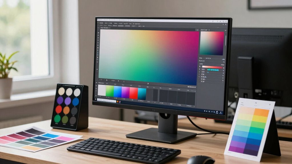
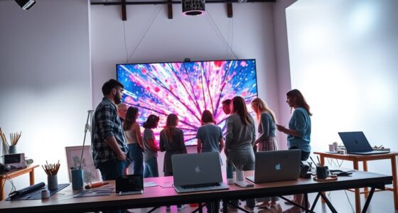
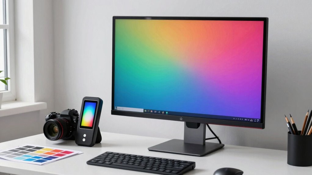
Have you ever wondered why colors look different across various devices and printers? It’s a common frustration, especially when you’re striving for consistency in your work. The key to solving this puzzle lies in understanding and applying effective color management techniques. One of the most vital steps is mastering calibration techniques and monitor profiling. These tools help ensure that your display, the primary window into your creative process, shows colors accurately. When your monitor is properly calibrated, it provides a reliable baseline, meaning what you see on-screen closely matches the final output. Without calibration, even the most talented artists and photographers risk chasing inaccurate colors, wasting time, and producing inconsistent results. Incorporating a color management system into your workflow further enhances accuracy and consistency across all devices and outputs. Calibration techniques involve using specialized hardware, like a colorimeter or spectrophotometer, to measure your monitor’s color output. These devices connect to your computer and guide you through a process that adjusts your display’s brightness, contrast, gamma, and color temperature. This isn’t a one-time task; regular calibration keeps your monitor’s color output consistent over time, compensating for aging screens and ambient lighting changes. Once your monitor is calibrated, the next step is monitor profiling. Profiling creates a detailed color profile for your display, translating its specific characteristics into a standard language that your editing software and operating system understand. This profile acts as a bridge, ensuring that colors are rendered correctly across various programs and devices.
Implementing robust calibration techniques and monitor profiling isn’t complicated, but it does require discipline. Schedule regular calibration sessions—weekly or monthly, depending on your workflow—to maintain accuracy. Use high-quality calibration hardware and trusted software to generate precise profiles. When you work with calibrated monitors and accurate profiles, you’re creating a solid foundation for your entire color management workflow. This consistency allows you to make informed color decisions, whether you’re editing photos, designing graphics, or preparing files for print. It also minimizes surprises when you view your work on other devices or when it’s printed.
Frequently Asked Questions
How Can I Calibrate My Monitor Effectively?
To calibrate your monitor effectively, start by using a reliable hardware calibration device, like a colorimeter, and follow the manufacturer’s instructions. This guarantees accurate monitor calibration, which is essential for maintaining consistent color. Adjust your monitor settings or use calibration software to achieve color consistency across your workflow. Regular calibration helps prevent color shifts, so make it a routine to keep your colors accurate and reliable.
What Software Tools Are Best for Color Management?
You should try software tools like Adobe Lightroom, Capture One, or DaVinci Resolve, which excel in managing color spaces and support precise color grading. These programs let you fine-tune your monitor calibration, ensuring consistent color output across devices. They also integrate with calibration hardware, helping you maintain accurate colors, so your workflow stays smooth and predictable. Pick the one that suits your needs for seamless color management.
How Do I Handle Color Profiles Across Devices?
Taming your device chaos begins with diligent color profile synchronization. You’ll want to make certain every device—monitor, printer, camera—speaks the same color language. Use calibrated tools and consistent software to maintain device color consistency. Don’t let your devices argue with each other; synchronize those profiles regularly. This way, you get predictable, beautiful results every time, instead of a shocking surprise when your print looks nothing like what you see on screen.
Why Do Colors Look Different on Various Screens?
Colors look different on various screens because each display has unique calibration and color profiles, affecting your perception of color and display consistency. When screens aren’t properly calibrated, your brain perceives colors differently, making images appear inconsistent. To fix this, you should calibrate your monitors regularly, use consistent color profiles, and make certain your device settings are optimized. This helps achieve accurate color perception across all your screens.
How Often Should I Recalibrate My Equipment?
Your monitor’s calibration frequency should be about once a month to keep colors accurate, as neglecting it can turn your workspace into a chaotic rainbow. Recalibrating regularly ensures your monitor remains within its ideal lifespan, preventing color shifts that could sabotage your projects. Even if you use top-tier equipment, environmental factors and usage intensity can cause drift, so staying consistent with calibration is essential for flawless color management.
Conclusion
So, after all that, you’d think mastering color management is impossible, right? Turns out, with a no-drama workflow, it’s surprisingly straightforward. No more endless tweaks or frustration—just accurate colors every time. Irony? The chaos you feared was just lack of a simple plan. Embrace this approach, and you’ll wonder why you ever struggled. After all, achieving perfect color shouldn’t feel like chasing unicorns—just some solid, no-drama steps.