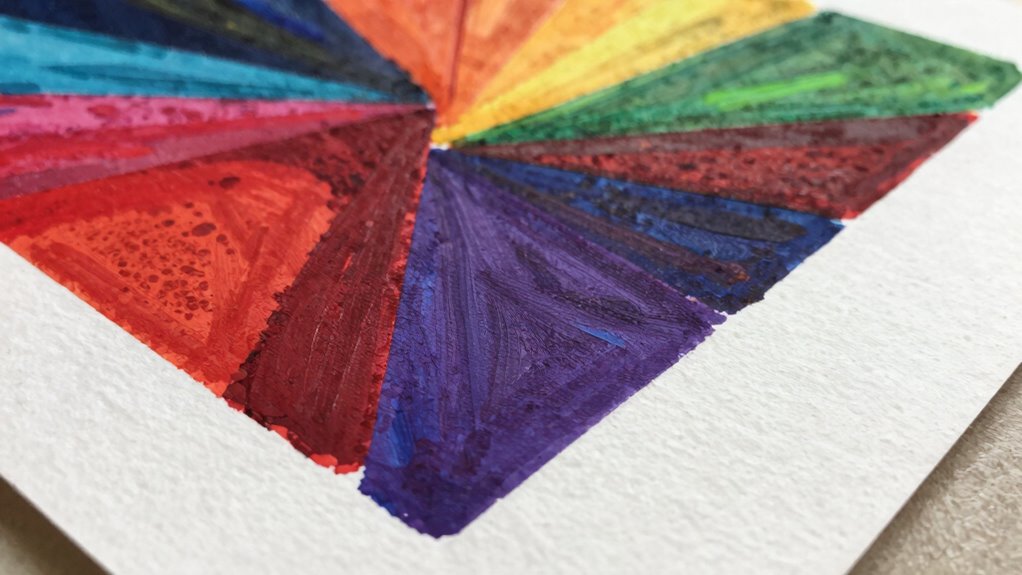
Your art prints look different from your screen because monitors emit light, making colors appear brighter and more vibrant, while prints reflect light, which can cause colors to look muted or altered. This fundamental difference means that even if your digital colors look perfect, they may not translate exactly in print. To get consistent results, you need to calibrate your monitor and use proper color management. Keep exploring how to bridge that color gap for stunning prints.
Key Takeaways
- Screens emit light, making colors appear brighter and more vibrant than they will in print.
- Without proper calibration, monitors can display inaccurate colors, causing discrepancies between on-screen art and printed results.
- Printed artwork reflects colors differently due to the subtractive color process and limited color gamut compared to digital displays.
- Lack of an accurate monitor profile leads to mismatched colors between what you see and what gets printed.
- Not soft-proofing with your printer’s ICC profile can result in unexpected color shifts in the final print.

You might notice that the art prints you buy often look different from what you see on your screen, and that’s because screens and printed artwork process colors differently. Screens display colors through emitted light, which can make images appear brighter and more vibrant than they are in physical form. When you order a print, however, it’s created using reflected light, which reveals a different range of colors and tones. This fundamental difference is often the primary reason your prints don’t match what you see on your monitor. To bridge this gap, understanding color calibration and monitor profiles becomes vital. color calibration is essential for ensuring your monitor displays colors accurately, aligning digital images with printed results.
Color calibration is the process of adjusting your monitor’s settings to guarantee that the colors you see are as accurate and consistent as possible. Without proper calibration, your screen might show overly saturated, dull, or skewed colors, leading to a false sense of how your artwork truly looks. When you calibrate your monitor, you’re aligning it with standardized color standards, so what you see on screen more closely resembles the final print. This involves adjusting brightness, contrast, gamma, and color temperature, usually with the help of calibration tools or software. By doing this regularly, you reduce the chances of surprises when your print arrives.
Monitor profiles, also known as ICC profiles, play a vital role in color management. These profiles describe how your monitor reproduces colors and help color management systems translate colors accurately between devices. When your monitor has an accurate profile, your editing software can display colors more reliably, giving you a true representation of the image. Without the correct profile, the software might interpret color data incorrectly, leading to mismatches between your screen and the printed output. Embedding the right monitor profile into your workflow ensures that color adjustments you make are based on a realistic view of how colors will appear in print.
To optimize your print results, start by calibrating your monitor with a quality calibration device. Make sure your monitor profile is correctly set up and selected within your editing software. Always work within a consistent lighting environment, as ambient light influences how you perceive colors. When you’re satisfied with your calibration and profiles, preview your work on different screens if possible, and consider soft-proofing using the printer’s ICC profile. This process helps you anticipate how the colors will appear once printed, reducing the chances of disappointment. Ultimately, investing time in proper color calibration and managing monitor profiles guarantees your digital artwork looks as close as possible to the printed piece, minimizing the gap between what you see and what you get.
monitor calibration tool
As an affiliate, we earn on qualifying purchases.
As an affiliate, we earn on qualifying purchases.
Frequently Asked Questions
How Do Different Printing Materials Affect Color Accuracy?
Different printing materials impact your color accuracy because their color gamut varies and their texture influences how colors appear. Smooth surfaces like glossy paper often show more vibrant, true-to-screen colors, while textured materials like canvas can dull or alter colors. You need to take into account both the material’s color gamut and texture to ensure your prints match your digital vision, as these factors directly affect how colors are rendered and perceived.
Can Lighting Conditions Change How Art Prints Appear?
Lighting conditions are like a chameleon changing its colors; they can totally alter how your art print appears. Ambient lighting and color temperature influence the way you perceive colors, making prints seem brighter, duller, warmer, or cooler. When the lighting shifts, so does the visual tone of your artwork. To see your print as intended, try viewing it under consistent, neutral lighting to keep the colors true.
Do Color Calibration Tools Improve Print-Screen Consistency?
Yes, color calibration tools improve print-screen consistency by enhancing color management. When you calibrate your monitor, you guarantee that what you see on screen accurately reflects true colors, making your print outputs more predictable and consistent. Regular monitor calibration helps you maintain accurate color profiles, reducing surprises in your final prints. This way, your art prints will match your digital designs much closer, saving time and materials.
How Does the Age of Artwork Influence Print Appearance?
As your artwork ages, it influences print appearance through art aging and print degradation. Over time, colors may fade or shift, and paper can deteriorate, causing prints to look different from the original. You’ll notice reduced vibrancy and altered details, especially if the artwork wasn’t stored properly. These changes highlight the importance of proper preservation and digital adjustments to maintain your artwork’s intended look in print.
Are There Specific Inks That Better Match Screen Colors?
A picture is worth a thousand words, and choosing the right inks makes all the difference. For better screen color matching, opt for inks designed for color accuracy, such as specific pigment-based or ultra-violet inks. These inks help replicate your digital hues more faithfully. Always test your ink selection on sample prints to guarantee your art’s colors stay vibrant and true to your screen.

Calibrite ColorChecker Classic Color Reference Target for Photo/Video Color Accuracy, 24 Patch Chart for White Balance and Color Grading, 8 x 11.5 inch Profile Creation and Editing Workflow Tool (CCC)
SPECIFICATIONS: 24 patch color reference target designed for photo and video workflows, supports white balance, exposure evaluation, and…
As an affiliate, we earn on qualifying purchases.
As an affiliate, we earn on qualifying purchases.
Conclusion
Think of your art as a painting seen through different glasses—your screen’s lens shows vibrant, digital colors, while the print is like looking through a foggy window, softening and muting those hues. To bring your art to life as you envision, remember that each medium has its own personality. Embrace the journey of adjusting and understanding these differences, so your printed masterpiece becomes a true reflection of your digital vision, clear and beautiful in its own right.

Calibrite Display 123 Monitor Calibration Colorimeter for Photo Editing and Color Accurate Viewing, Easy 1 2 3 Software Workflow, USB C Connection, and Before and After Check, Supports 2 Displays
SPECIFICATIONS: Monitor calibration colorimeter with Easy 1 2 3 software workflow, USB C connection, compact body approx. 34mm…
As an affiliate, we earn on qualifying purchases.
As an affiliate, we earn on qualifying purchases.

Bob Ross Color-by-Number
As an affiliate, we earn on qualifying purchases.
As an affiliate, we earn on qualifying purchases.