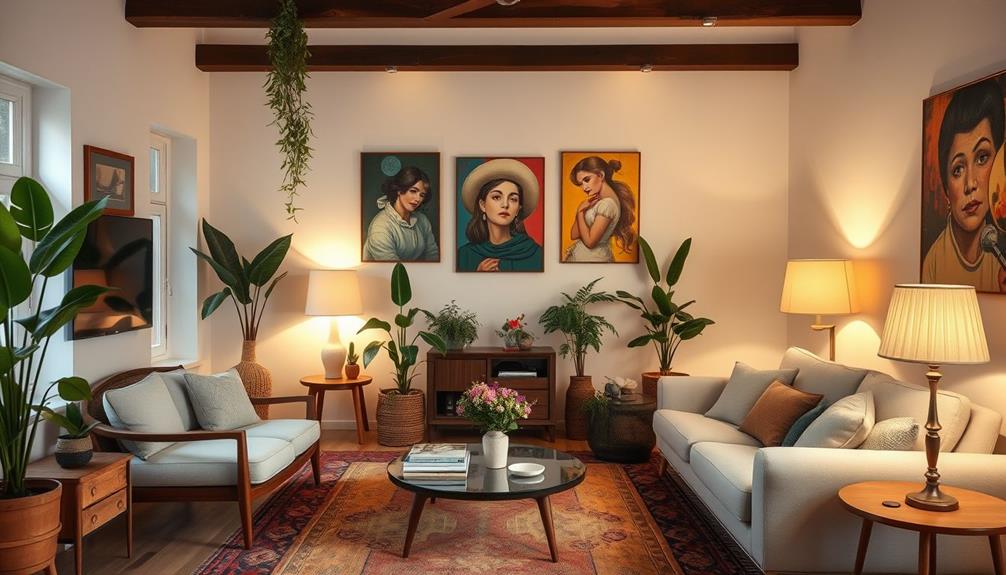
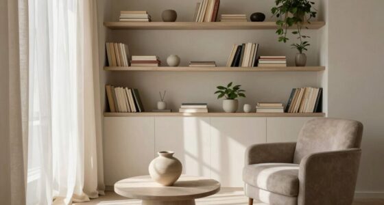
Creating a beautiful interior is about more than just choosing a few favorite hues; it’s essential to understand the principles of color harmony. Whether you are new to decorating or looking to refresh your space, knowing how to combine colors interior design can elevate your home’s aesthetic and evoke specific emotions. Color theory interior design offers you the tools to create inviting and balanced spaces that reflect your personal style.

Get the latest gadgets delivered free with Prime
- Fast, free delivery on millions of items
- Prime Video, Amazon Music and more included
- Member-only deals all year
This section will guide you through foundational concepts in color harmony, revealing how to mix colors effectively. By understanding color psychology in home decorating, you’ll be equipped to select palettes that create the ambiance you desire. With 12 basic colors shown on the color wheel and tools like Kuler by Adobe at your fingertips, creating cohesive color schemes becomes an enjoyable process. Get ready to explore the world of colors and transform your living space into a true reflection of your personality.
Key Takeaways
- Understanding color theory is vital for successful interior design.
- Utilize the color wheel to guide your color combinations effectively.
- Implement the 60-30-10 rule for a balanced color palette.
- Explore monochromatic, complementary, and analogous color schemes.
- Experiment with shades and tones to add depth to your space.
- Patterned fabrics can enrich your design while mixing colors.
Understanding Color Theory in Interior Design
Color theory forms the backbone of effective interior design. It encompasses the principles that outline how colors interact, helping you navigate the complex world of color schemes. By grasping these principles, you can make informed choices that elevate your home’s aesthetic. Understanding color theory allows you to create a balanced and harmonious environment, vital for your home decor.
What is Color Theory?
Color theory involves a structured approach to how colors blend and contrast. The framework begins with primary colors: red, yellow, and blue. From these, secondary colors such as green, orange, and purple arise through mixing. Tertiary colors result from blending primary and secondary hues in specific ratios. You can choose the right color combinations to craft stunning interiors by understanding these color relationships.
The Importance of Color Theory in Home Decor
Incorporating color theory into your interior design enhances the atmosphere and mood of your space. Recognizing how warm colors, such as reds and yellows, invoke feelings of energy while cool colors, like blue-green, promote tranquility, empowers you to curate your environment. Neutral tones harmonize various styles, making them versatile choices for furniture and accents.
Color schemes for home decor play a crucial role in achieving visual appeal. Multiple color schemes exist, including:
- Monochromatic: Variations of one color.
- Analogous: Colors next to each other on the wheel.
- Triadic: Three colors evenly spaced.
- Complementary: Opposite colors on the wheel.
- Tetradic: Two pairs of complementary colors.
- Split Complementary: A base color with adjacent complements.
The 60-30-10 rule serves as a guiding principle for choosing color combinations: allocate 60% for a dominant color, 30% for a secondary color, and 10% for accents. This approach maximizes aesthetic balance and allows your chosen palette to shine, providing a cohesive visual experience throughout your home.

| Color Type | Examples | Psychological Impact |
|---|---|---|
| Primary Colors | Red, Blue, Yellow | Bold and vibrant feelings |
| Secondary Colors | Green, Orange, Purple | Energy and creativity |
| Tertiary Colors | Red-orange, Yellow-green, etc. | Complex atmospheres |
| Warm Colors | Reds, Yellows | Inviting and stimulating |
| Cool Colors | Blues, Greens | Calm and relaxed |
| Neutral Colors | Grays, Whites | Balanced and versatile |
Understanding these basic elements of color theory in interior design allows you to create spaces that resonate with your personal style while maintaining harmony and balance through color schemes for home decor. Choosing the right color combinations becomes a powerful tool in your design arsenal.
How to Combine Colors Interior Design
Combining colors effectively requires a clear understanding of how colors work together. Using a color wheel for interior design can be instrumental in making harmonious choices. This tool helps identify complementary colors that sit opposite each other on the wheel, as well as analogous colors found side-by-side. With this knowledge, you can enhance your space by mixing and matching color palettes that elicit the desired atmosphere.
Utilizing the Color Wheel for Effective Combinations
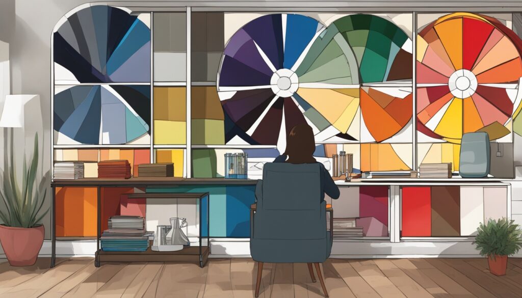
The color wheel is not just a visual guide; it also serves as a foundational element in coordinating colors in interior design. For effective combinations, consider the 60-30-10 rule. This guideline suggests that 60% of a room should feature the dominant color, while 30% should use a secondary color. The remaining 10% incorporates an accent color to add visual interest. For instance, imagine a living room with soft blue walls (60%), gray furniture (30%), and striking orange accents (10%). This creates a balanced, inviting space.
Understanding Color Schemes
Incorporating various color schemes can significantly elevate your interior design game. Different styles of furniture and accessories can create a unique aesthetic when paired with the right colors. For example:
- Complementary: Red paired with green creates vibrant contrast.
- Analogous: Blue and green offer a serene, cohesive look.
- Triadic: A combination of three evenly spaced colors like red, yellow, and blue can produce high visual impact.
- Tetradic: Combining two pairs of complementary colors allows for varied expression and dynamics.
Maintaining color consistency throughout your home not only enhances decor cohesiveness but also simplifies the decorating process. Utilizing shades and tones from a single color palette ensures a flowing aesthetic, while carefully selecting details can add depth and increase visual interest in the space. Personalizing color schemes based on individual preferences leads to interiors that are truly stylish and reflective of your personality.
| Room Type | Color Combination | Recommended Atmosphere |
|---|---|---|
| Living Room | Blue and White | Classic, fresh ambiance |
| Bedroom | Gray and Yellow | Vibrant atmosphere |
| Bathroom | Mint Green and White | Fresh look |
With thoughtful coordination and a little creativity, mixing and matching color palettes can transform your interiors into beautiful, inviting spaces. Spread your inspiration by sharing your finished projects on social media, and help others discover the beauty of the color wheel in their own homes.
The Role of Color Psychology in Home Decorating
Understanding the role of color psychology in home decorating can transform your living space into a sanctuary that reflects your personality and influences your emotional well-being. The emotional impact of colors not only affects how a room feels but also how you interact with the space. Selecting the right hues can lead to a cozy retreat, a vibrant social hub, or a calming escape tailored to your needs.
Emotional Impact of Colors
Different colors evoke distinct emotions, making it essential to consider their meanings before choosing your palette. For instance:
- Red: This color ignites passion, excitement, and ambition.
- Orange: Stimulates activity, socialization, and joy.
- Yellow: A vibrant hue linked to happiness and optimism.
- Green: Evokes feelings of balance, growth, and restoration.
- Blue: Promotes tranquility, neutrality, and community.
- Purple: Sparks creativity and inspiration.
- Pink: Represents love and nurturing, suitable for diverse designs.
- White: Conveys purity and cleanliness, enhancing versatility.
- Black: Signifies power, mystery, and drama.
- Brown: Associated with safety, security, and warmth.
The emotional impact of these colors varies significantly based on individual perceptions and cultural backgrounds. Recognizing these differences helps in creating an inclusive environment that resonates with everyone.
Choosing Colors Based on the Mood You Want to Create
When it’s time to select your colors, think about the mood you want to foster in your space. Here are some tips:
- For a cheerful atmosphere, consider warm shades like red, orange, and yellow.
- To instill a sense of calm and peace, lean towards cool colors such as blue and green.
- For creative inspiration, incorporate purples and pinks into your decor.
- If you aim to showcase sophistication, a palette of black and white can make a dramatic statement.
Integrating color psychology in home decorating allows you to craft environments that not only showcase current interior design color trends but also evoke specific feelings and experiences that enhance your daily life.

Popular Color Schemes for Home Decor
Understanding popular color schemes for home decor plays a crucial role in creating inviting and harmonious spaces. Choosing the right combinations can significantly impact the overall aesthetic of your interiors. Here, we discuss some well-loved palettes that you can explore, enhancing your coordination of colors in interior design.
Complementary and Analogous Colors
Complementary colors are positioned opposite each other on the color wheel, such as blue and orange. This combination creates a vibrant contrast that can energize a room. Analogous colors, like yellow and green, sit next to each other on the wheel. They provide a more serene and cohesive appearance, perfect for promoting a calm atmosphere. To maintain interest while using complementary or analogous colors, 3 to 5 colors in a room design are often recommended.
Triadic and Tetradic Color Schemes
Triadic color schemes encompass three colors that are equally spaced on the color wheel, providing a dynamic yet balanced look. Examples include red, yellow, and blue for a classic triadic setup. Tetradic schemes feature two complementary pairs, such as red and green combined with blue and orange, leading to a rich and diverse color palette. Understanding these color schemes for home decor allows you to mix different hues while maintaining visual harmony.
| Color Scheme | Description | Example Colors |
|---|---|---|
| Complementary | Contrasting hues that enhance each other when paired | Blue & Orange |
| Analogous | Colors that are adjacent on the color wheel for a harmonious feel | Yellow & Green |
| Triadic | Three evenly spaced colors for a vibrant look | Red, Yellow & Blue |
| Tetradic | Two complementary color pairs providing a varied palette | Red, Green, Blue & Orange |
Conclusion
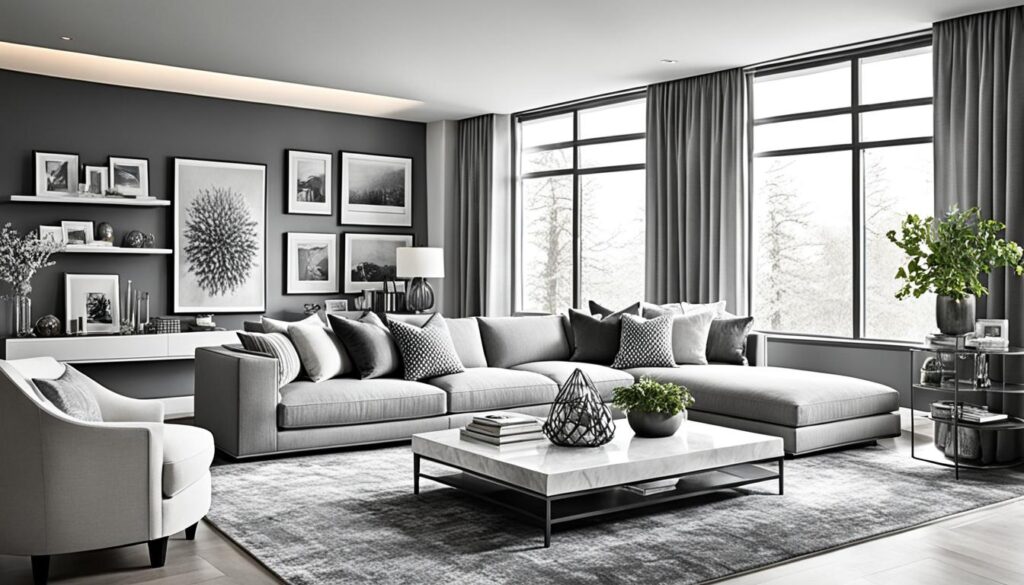
Mastering how to combine colors in interior design can truly transform your living spaces into beautiful reflections of your personal style. By understanding color theory, you can see how the traditional color wheel, consisting of primary colors like red, blue, and yellow, serves as the foundation for mixing and matching color palettes that are both harmonious and visually striking. Whether you favor complementary colors for their bold contrasts or analogous colors for a serene effect, the right choices can harmonize your home decor flawlessly. When considering color combinations, don’t forget about the impact of metallic accents like silver and gold decor. These timeless hues can add a touch of elegance and sophistication to any room, whether it’s through picture frames, mirrors, or decorative accessories. By incorporating these metallic elements into your color scheme, you can elevate the overall aesthetic and create a sense of luxury within your home.
Leveraging different color schemes—monochromatic for sophistication or triadic for liveliness—can lead to stunning results. Utilizing the 60-30-10 rule allows for a balanced application of colors, ensuring that your dominant hues shine while still providing an accent, enhancing the overall aesthetic of the space. Don’t overlook the importance of textures and patterns, as they can infuse depth and energy into your interiors, guiding the visual journey throughout your rooms.
Ultimately, the journey of mixing and matching color palettes is about self-expression and experimentation. Embrace various color contrasts and combinations to achieve a space that not only reflects your taste but also evokes the desired emotions. As you dive into the world of color theory in interior design, let your home become a canvas for your unique vision and creativity.
FAQ
What is color theory in interior design?
Color theory is the framework that explains how colors interact and relate to each other. It includes concepts like primary, secondary, and tertiary colors, which help you create visually appealing color combinations for your home decor.
How can I choose the right color combinations for my home?
To choose the right color combinations, familiarize yourself with the color wheel and the principles of color theory. Explore complementary, analogous, triadic, and tetradic colors to find pairs that resonate with your personal style and desired atmosphere.
What is the significance of the color wheel in interior design?
The color wheel is a visual representation that showcases the relationships between colors. It helps you identify complementary and analogous colors, enabling you to create harmonious and balanced interiors.
How does color psychology play a role in home decorating?
Color psychology involves understanding how different colors evoke emotions and influence the atmosphere of a space. By applying this knowledge, you can choose colors that foster the desired mood, whether you aim for warmth, calmness, or creativity in your home.
What are the popular color schemes I can use for home decor?
Popular color schemes include complementary colors (like blue and orange), analogous colors (such as yellow and green), and triadic schemes (three equidistant colors). These combinations can create a visually pleasing and cohesive look in your interiors.
What is the 60-30-10 rule in color combination?
The 60-30-10 rule suggests that 60% of a room should be the dominant color, 30% a secondary color, and 10% an accent color. This approach ensures balance and harmony in your color scheme.
How can I effectively mix and match color palettes?
To effectively mix and match color palettes, first understand the principles of color harmony and use the color wheel as a guide. Don’t hesitate to experiment with various combinations, keeping in mind the emotional impact of the colors you choose.
Fall Picks
fall essentials
As an affiliate, we earn on qualifying purchases.