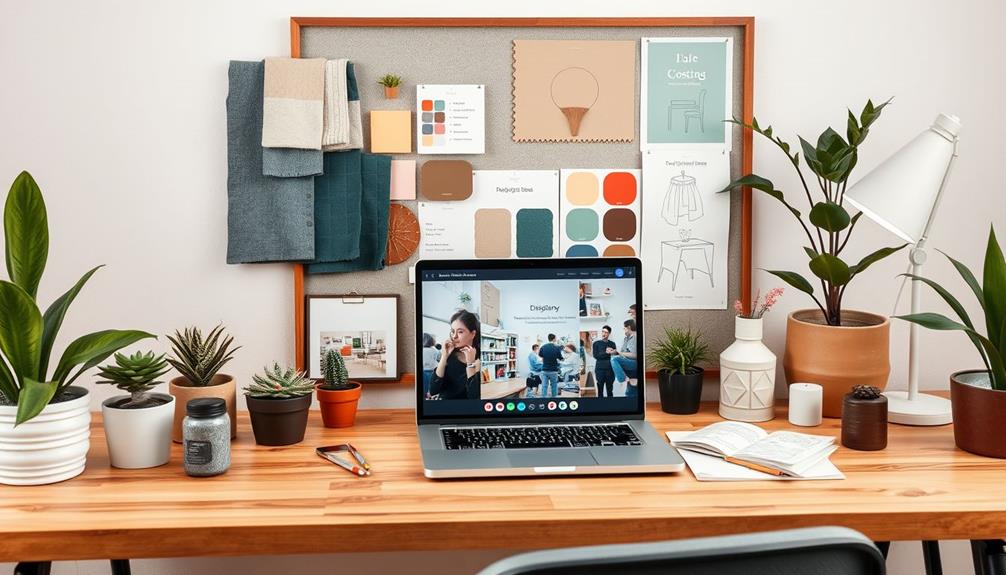
To use a color wheel for interior design, start by identifying your primary and complementary colors. Choose a dominant color for 60% of the space, a secondary color for 30%, and an accent for 10% to create balance. Use analogous colors for a harmonious feel or opt for complementary colors for striking contrasts. Consider the room's function: warm colors energize spaces like dining rooms, while cool colors promote tranquility in bedrooms. Test paint samples in different light to see how they truly look. Want to discover more effective color combinations and tips? There's plenty more to explore! If you’re new to using a color wheel for interior design, consider seeking out additional resources to help guide you through the process. One helpful tool is a Sketchup interior design tutorial, which can provide step-by-step instructions and visual demonstrations for incorporating color theory into your design. These tutorials can offer valuable insights and techniques for creating visually stunning and cohesive spaces using the color wheel as a guide. Whether you’re a beginner or a seasoned designer, there’s always more to learn and explore in the world of interior design.
Key Takeaways
- Identify primary, secondary, and tertiary colors on the color wheel to create a diverse palette for your interior design project.
- Use complementary colors from the wheel to create striking contrasts that enhance visual interest in your space.
- Choose analogous colors for a harmonious look, blending 2-3 adjacent colors for a cohesive design scheme.
- Apply the 60-30-10 rule to balance dominant, secondary, and accent colors for a well-proportioned aesthetic.
- Test paint samples in various lighting conditions to ensure your chosen colors harmonize effectively in the intended space.
Top picks for "colour wheel interior"
Open Amazon search results for this keyword.
As an affiliate, we earn on qualifying purchases.
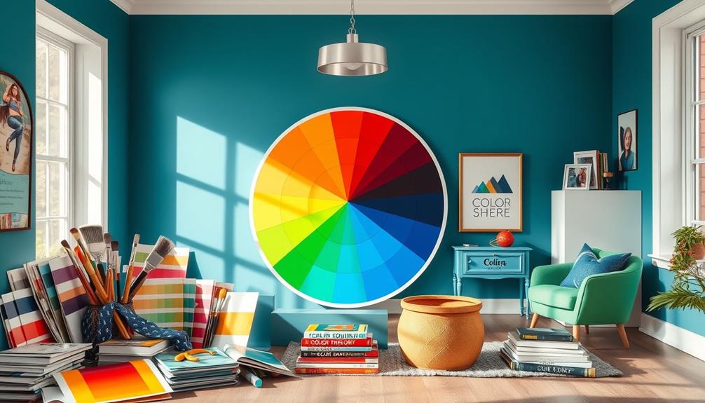
Understanding the Color Wheel
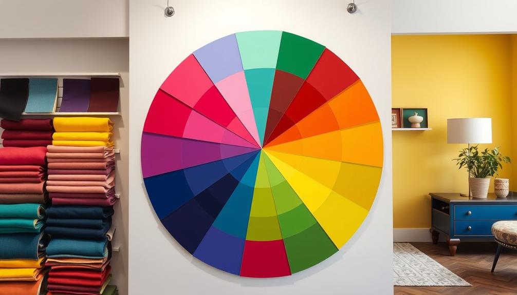
Understanding the color wheel is key to making informed choices in interior design. This wheel comprises 12 distinct colors, including three primary colors: red, yellow, and blue. From these, you can create secondary colors like orange, green, and purple, along with various tertiary shades such as red-orange and blue-green. Knowing how these colors interact helps you select the right color schemes for your space.
For instance, incorporating a modern farmhouse bedroom theme can benefit from a well-thought-out color palette that promotes serenity and comfort.
You'll find that complementary colors sit opposite each other on the wheel, offering striking contrasts. Meanwhile, analogous colors, located next to one another, provide a more harmonious look. If you want a balanced feel, consider using a triadic color scheme, which involves three evenly spaced colors on the wheel.
When you choose warm colors like reds and yellows, you can evoke energy and vibrancy in a room. In contrast, cool colors such as blues and greens create a calming atmosphere.
Color Schemes and Their Effects
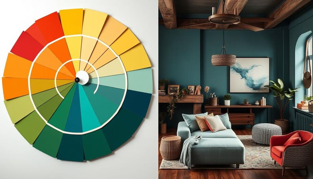
How can the right color scheme transform your space? Selecting the perfect color scheme can greatly impact the mood and atmosphere of your home. Warm tones like reds, oranges, and yellows infuse energy and excitement, whereas cool tones such as blues and greens create a sense of calmness and tranquility.
You can choose from various schemes derived from the color wheel. Monochromatic schemes feature variations of a single color for a cohesive look, while analogous schemes combine 2-3 adjacent colors for a harmonious effect.
Complementary colors, located opposite each other on the wheel, enhance visual interest with bold contrasts, making them great for focal points. If you're aiming for vibrancy, consider triadic color schemes, which use three evenly spaced colors for a dynamic range.
To maintain balance, use the 60-30-10 rule: allocate 60% of your space to a dominant color, 30% to a secondary color, and 10% to an accent color.
Psychological Impact of Colors

Colors don't just shape the aesthetics of a space; they profoundly affect your mood and behavior. The psychological impact of colors in interior design is significant.
For instance, warm colors like red and yellow can stimulate energy and excitement, making them perfect for lively areas like dining rooms. Red encourages appetite and social interaction, while yellow evokes happiness, ideal for kitchens and playrooms.
On the flip side, cool colors such as blue and green promote calmness and relaxation. Blue is often associated with tranquility and trust, making it a smart choice for bedrooms and office spaces where you want to foster a peaceful atmosphere.
Green, representing nature, creates an invigorating environment that's perfect for living areas aimed at relaxation.
Practical Design Guidelines

While selecting the right colors for your space can feel overwhelming, following some practical design guidelines can simplify the process.
Start by utilizing the 60-30-10 Rule to create a balanced color scheme. This means allocating 60% of a dominant color, 30% for a secondary color, and 10% for an accent color. It creates a harmonious scheme that's visually appealing.
Next, use the Color Wheel to build cohesive color combinations. Consider the primary and secondary colors to create a color palette that reflects your intended mood. For example, warm tones evoke coziness, while cool tones promote calmness.
Before making a commitment, be certain to test paint samples in various lighting conditions. Lighting can notably alter how colors appear, affecting the overall ambiance of your space.
Here are a few tips to keep in mind:
- Reference color undertones in materials to guarantee overall cohesion.
- Create custom color palettes for clear design direction.
- Always consider the function of each room when selecting colors.
Tools for Color Application
To effectively apply color in your interior design projects, utilizing various tools can make a significant difference.
Start with a color wheel to explore primary colors and complementary colors, helping you identify harmonious color combinations for your space. Consider using color palette creator tools that allow you to visualize and experiment with these combinations, ensuring they align with your design vision.
Digital color palette generators are also invaluable, as they can inspire fresh ideas and help you create custom palettes that reflect your desired mood and style.
Don't forget to test paint swatches in different lighting conditions, since the color temperature can alter how hues appear in your interior.
Engaging with design communities, such as those on platforms like Spoak, opens up avenues for learning and inspiration.
These communities often provide educational resources and feedback, enabling you to apply color theory effectively in your designs.
Conclusion
So, armed with your trusty color wheel, you're ready to transform your space into a masterpiece—because who wouldn't want their living room to scream "I'm a trendy decorator" or "Help, I've been swallowed by a paint store"? Just remember, while colors can evoke emotions, your cat might not appreciate your bold choices as much as you do. Go ahead, release your creativity, but maybe keep the neon orange for the laundry room—unless you're aiming for chaos, of course!