Creating a color board is an essential step in the interior design process, enabling you to visually weave together your ideas and preferences into a coherent representation of your style. This interior design color board tutorial will guide you through the steps of how to make a colour board for interior design that not only reflects your personal aesthetic but also helps you visualize how various elements work together in your space. Utilizing digital tools like Canva can significantly simplify this process, allowing you to create a stunning color palette in as little as 15 minutes. With Canva being favored by 99% of users for design mood boards, you’ll find it’s a user-friendly option for bringing your vision to life.
As you embark on this colorful journey, remember that gathering the right design elements such as flooring, paint color swatches, textiles, and accessories is crucial. We’ll cover tips, insights, and specific steps on how you can capture the essence of your desired space with effective color blending, ensuring you make informed decisions effortlessly. Let’s dive into the vibrant world of interior design!
Key Takeaways
- Mood boards are essential for visualizing design ideas and preferences.
- Digital tools like Canva have revolutionized the way color boards are created.
- Time-efficient mood board creation can take as little as 15 minutes.
- Include various design elements like paint swatches and textiles for a cohesive look.
- Consider using a Canva Pro account for additional features like background removal.
- Regularly updating your color board can streamline the design process.
The Importance of a Color Board in Interior Design
Creating a stunning interior space involves careful planning and thoughtful choices, making a color board an essential tool in your design arsenal. This visual representation of your design ideas plays a crucial role in ensuring clarity and direction throughout the process of choosing colors for room decor. Utilizing a color board allows you to compile colors, textures, and materials in one cohesive visual, enhancing communication among all parties involved. By organizing interior design color combinations on a color board, you can easily experiment with different palettes and see how they interact with each other. This allows you to make informed decisions about which colors will work best together in your space. Additionally, having a visual representation of your color choices can help you stay focused and on track as you work towards creating a cohesive and harmonious interior design scheme.
Visualizing Your Ideas
Using a color board transforms abstract ideas into tangible visuals. A well-constructed board showcases different options and combinations, aiding you in making informed decisions. You can use traditional methods such as paper, scissors, and glue, or take advantage of digital tools like Canva and Foyr to create an efficient interior design color board tutorial. This versatility allows you to express your design vision accurately, keeping everyone aligned with your goals.
Maintaining a Consistent Theme
A color board is invaluable in maintaining a consistent theme throughout your project. By selecting at least four main colors for your palette, you ensure each element complements the others in your design. Such organization streamlines the process and can significantly reduce time and resources compared to producing physical mockups. With the feedback from clients and stakeholders integrated into the color board, it fosters effective communication and cooperation, ensuring that your vision aligns with their expectations.

| Color Board Benefits | Details |
|---|---|
| Visual Representation | Transforms ideas into tangible visuals for better understanding |
| Communication Tool | Aligns designers, clients, and stakeholders for cohesive decision-making |
| Consistent Theme | Ensures all colors and elements complement each other throughout the design |
| Efficient Design Process | Reduces time and money investment compared to mockups and prototypes |
| Feedback Integration | Allows for refining ideas based on client input |

EVEO Screen Cleaner Spray - Large Screen Cleaner Bottle - TV Screen Cleaner, Computer Screen Cleaner, for Laptop, Phone, Ipad - Computer Cleaning kit Electronic Cleaner (1 Pack)
Screen Cleaner is Your Screen’s New Bestfriend! - EVEO is proud to present a screen cleaner that’s perfectly...
As an affiliate, we earn on qualifying purchases.
How to Choose Colors for Your Interior Design
Selecting the right colors for your interior design project requires time and consideration. Understanding color theory serves as a foundation for creating a color palette that harmonizes well within your space. You can use a color wheel to identify complementary and contrasting colors, enabling a cohesive look. Emphasizing the significance of balance is crucial; mixing warm tones with cooler shades can yield a pleasant design outcome.
Understanding Color Theory
Color theory focuses on how colors interact with one another. It helps you choose colors that create inviting atmospheres. By using a palette of 3 to 5 colors, your design remains coherent while retaining an engaging appearance. This method allows for creativity without overwhelming the senses.
Using Color Palettes
Creating a color palette is an exciting part of your design journey. You may explore various apps, such as Coolors, Pantone, and Canva, for inspiration and organization. These tools offer preselected palettes and the option to extract colors from photos, enhancing your color inspiration for home design. Remember, the key colors will often serve as the most visible elements in your layout, typically neutrals, while remaining colors will contribute to accessories and smaller decor pieces, providing vibrancy and unity throughout your space.
Identifying Your Style
Recognizing your design style influences your color choices. Whether you lean towards modern minimalism, rustic charm, or eclectic arrangements, ensure that your color scheme ideas for home decor adhere to your aesthetic vision. Incorporating elements like classic metals or warm woods can heighten the timeless appeal of your design.

| Style | Key Colors | Additional Colors |
|---|---|---|
| Modern | Neutrals (White, Gray) | Pops of Bold Colors (Red, Blue) |
| Rustic | Earthy Tones (Brown, Green) | Warm Accents (Mustard, Rust) |
| Eclectic | Vibrant Colors (Turquoise, Magenta) | Complementary Neutrals (Cream, Beige) |

Screen Cleaner Spray (16oz - 473ml) – Best Large Cleaning Kit for LCD LED OLED TV, Smartphone, iPad, Laptop, Touchscreen, Computer Monitor, Electronic Devices, Microfiber Cloth Wipes and 2 Nozzles
SCREEN CLEANER SPRAY and cloth are designed for the high-end devices and works flawlessly for all electronic screens,...
As an affiliate, we earn on qualifying purchases.
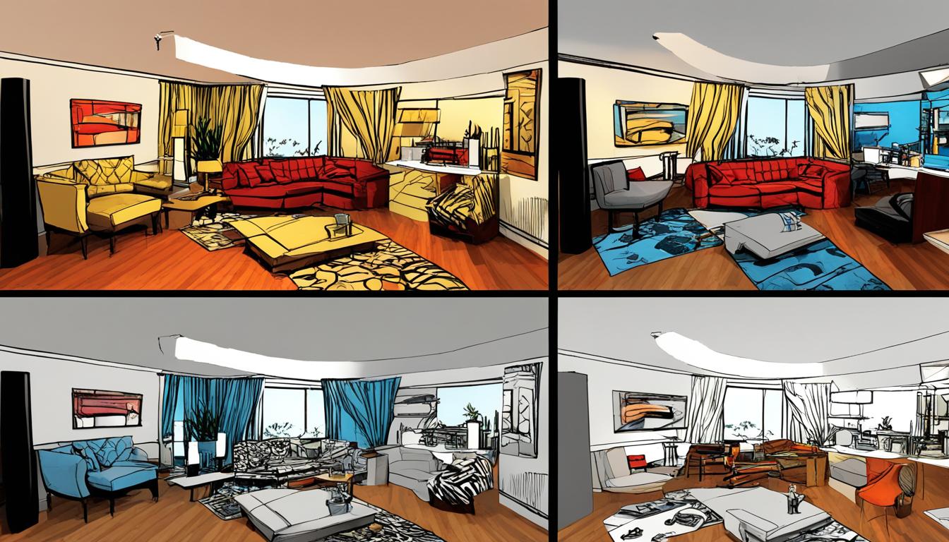
How to Make a Colour Board for Interior Design
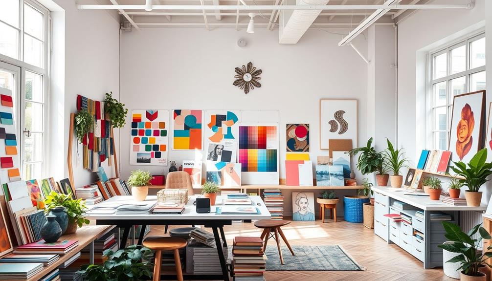
Creating a stunning DIY interior design color palette begins with gathering inspiration. A variety of sources can spark your creativity and provide the foundation for your color board. Using platforms like Pinterest allows you to explore images, colors, and textures that resonate with your vision. Interior design magazines also serve as rich resources for ideas that cater to your personal aesthetic.
Gathering Inspiration
Dive into the world of design by collecting visuals that inspire you. Focus on elements that capture your desired atmosphere. Consider collecting images that include textiles, paint colors, furnishings, and decor accessories. This process will give you a clearer sense of what you want to incorporate into your space.
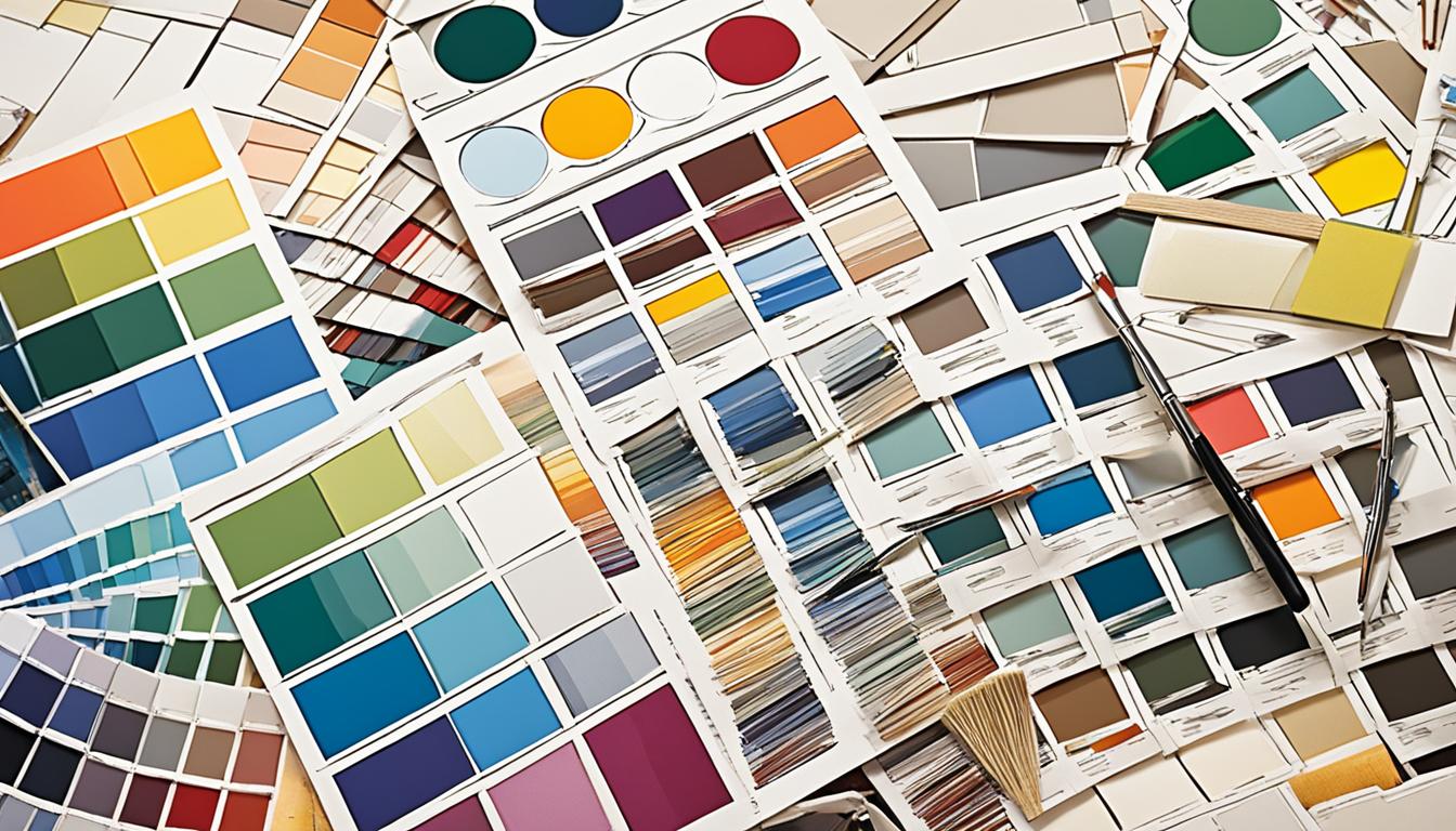
Collecting Samples and Swatches
Once you have a catalog of inspirations, move on to collecting actual samples and swatches. These tangible materials will help you visualize how colors and textures interact in your intended design. Brands often provide free swatches for fabrics and paint, which can enhance the authenticity of your DIY interior design color palette. Consider using Google Sheets to organize your findings. This tool can help track item links, prices, and your overall budget as you progress.
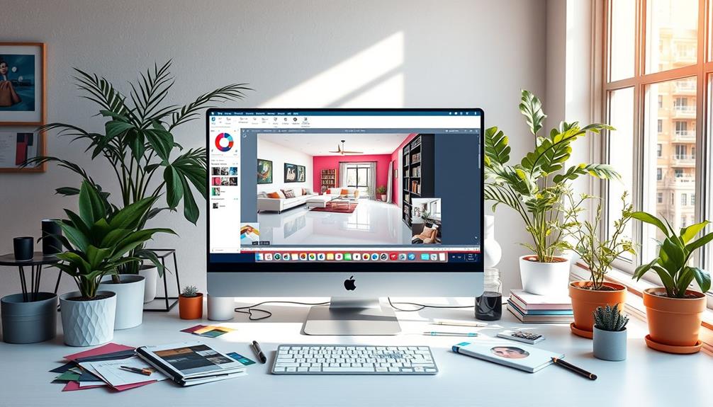
Using Digital Tools like Canva
Integrating digital tools into your design process can elevate your color board. Canva, a user-friendly and free online graphic design tool, is perfect for compiling your ideas seamlessly. You can resize, crop, and arrange your visuals easily. Gather elements such as wood finishes, light fixtures, and plumbing fixtures to enrich your mood board. Embedding links to products can simplify future sourcing. Using these interior design mood board tips allows you to effectively visualize how various elements work together, streamlining decision-making for your project.

Screen Mom Screen Cleaner Spray and Microfiber Cloth 16oz Screen Cleaner Spray and Wipe for TV, Laptop, Computer, Phone, iPad, Car Screen Cleaning Kit Electronic Cleaner Spray
STREAK FREE FORMULA FOR CRYSTAL CLEAR SCREENS: Screen Mom tv cleaner spray and cloth advanced streak-free screen cleaner...
As an affiliate, we earn on qualifying purchases.
Creating a Color Palette for Your Space
When it comes to designing your home, creating a color palette can feel intimidating. However, with an understanding of mixing colors effectively, you can establish a beautiful scheme that fits your personal style. Begin by selecting a base or neutral shade that acts as the foundation for your palette—options such as warm whites, light pinks, or off-whites can set the stage for further exploration. This foundation allows you to layer in vibrant hues or complementary tones that truly represent your vision.
Mixing Colors Effectively
Utilizing a color wheel can significantly enhance your approach to mixing colors. Familiarize yourself with various schemes, like analogous colors that share similar tones, complementary colors which contrast, and monochromatic combinations that feature varying shades of one hue. Consider using the 60-30-10 rule, where 60% of the space is a primary color, 30% a secondary, and 10% an accent. This technique not only provides a balanced view but also inspires creativity in selecting color scheme ideas for home decor tailored to your preferences.
Choosing Complementary and Contrasting Colors
Integrating accent colors is essential for adding visual interest to your space. Select bold tints that stand out against your base colors, whether in a complementary scheme or among analogous tones. Don’t shy away from incorporating various patterns and textures through area rugs, pillows, or even window treatments, which can elevate your palette. Neutrals remain a popular choice for walls; however, feel free to experiment with cheerful shades to create an inviting atmosphere. Remember, the goal is to make your space feel uniquely yours while encouraging a harmonious flow and brightness, enhanced with the right lighting fixtures for optimal effect.

Koala Eyeglass Lens Cleaner Spray Kit | (2x) Glasses Cleaner Bottle + (2x) Microfiber Cloth | Alcohol Free Eyeglasses, Screen, and Camera Cleaning Kit | Made in USA (4 Piece Set)
CRYSTAL CLEAR VISION – EVERY TIME: Our obsessively engineered, best-in-class formula is the only streak-free glasses cleaner that...
As an affiliate, we earn on qualifying purchases.
FAQ
What is a color board, and why is it important in interior design?
A color board is a visual representation of your design ideas, helping you communicate your vision clearly and ensure your selections work well together. It’s essential for staying aligned with your interior design goals and making informed decisions.
How can I start creating a color palette for my room?
Begin by gathering inspiration from sources like Pinterest and design magazines. Use a color wheel to understand complementary and contrasting colors. Collect samples of colors and textures that resonate with your personal style to create a harmonious palette.
What tools can I use to create my color board?
Digital tools like Canva are fantastic for compiling your color board. They allow you to easily adjust, resize, and organize elements, making the process enjoyable and effective.
How do I choose the right colors for my interior space?
Understand color theory and assess your personal style. Consider the atmosphere you want in the room, whether modern, rustic, or eclectic. Ensure that the chosen colors deliver the mood you wish to create.
Can I use physical samples for my color board?
Yes! Collecting actual paint swatches, fabric samples, and material samples enhances the authenticity of your color board. Most brands offer free swatches—you should take advantage of these to see how various textures and colors work together.
What are some tips for mixing colors effectively?
Aim for balance between complementary and contrasting colors. For instance, pair light neutrals with bold accent colors to create depth. This approach enhances the visual appeal while maintaining a cohesive look.
How can I ensure my color choices align with a theme?
Having a color board helps maintain a consistent theme throughout your space. Gather elements that support your desired aesthetic and check that they complement each other. Regularly refer to your color board during the selection process to stay on track.