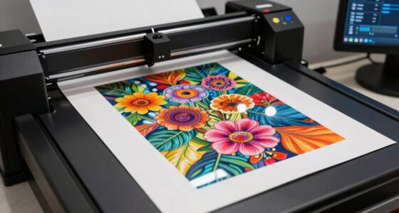
The color accuracy mistake that can ruin your digital and physical workflows often stems from poor monitor calibration. If your monitor isn’t calibrated, the colors you see may not match what gets printed, leading to disappointing results. Ignoring color profiles and inconsistent lighting further complicates accurate color representation. To guarantee your projects look vibrant and consistent across various media, it’s essential to adopt sound color management practices. Discover more about refining your process and achieving perfect color accuracy.
Key Takeaways
- Failing to calibrate monitors can lead to inaccurate color representation, impacting both digital and print outcomes.
- Inconsistent color profiles between devices create discrepancies, resulting in poor color accuracy in final products.
- Poor lighting conditions during editing can distort color perception, leading to misguided decisions in color adjustments.
- Neglecting color management practices can result in costly mistakes and inconsistent workflows across projects.
- Regularly updating knowledge on color management techniques is essential for maintaining high-quality color accuracy.
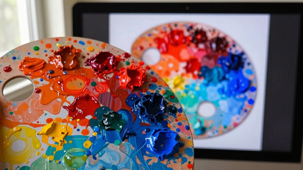
When you’re working with colors in design or photography, a common mistake can lead to frustrating results. You might think your colors look perfect on your screen, but without proper monitor calibration, you’re setting yourself up for disappointment. If your monitor isn’t calibrated correctly, the colors you see won’t match what gets printed or displayed on other devices. This mismatch can throw off your entire project, leaving you wondering why your carefully chosen hues suddenly look dull or overly saturated once you hit print.
Proper monitor calibration is essential; without it, your vibrant colors may turn dull or overly saturated in print.
One of the biggest issues arises from using inconsistent color profiles. Different devices use different color spaces, and if you don’t manage these profiles properly, you’ll end up with a big headache. Make sure to check your software settings to confirm you’re using the right color profiles for both your monitor and printer. If you’re working in Adobe Photoshop, for instance, verify that your working RGB space matches your monitor’s capabilities. This attention to detail can make all the difference in achieving print consistency.
Lighting conditions also play a significant role in how you perceive color. If you’re editing your images in a room with poor lighting, you might be misled about how colors truly look. Natural light is often the best option for evaluating color, so consider adjusting your workspace for ideal viewing. Remember, what you see in a dimly lit environment might not reflect the true vibrancy of your colors in brighter settings. Additionally, understanding color management can help ensure your color workflow remains consistent across devices. Proper monitor calibration is essential to maintaining accurate colors and avoiding costly mistakes. Being aware of the lighting environment can further improve your ability to judge colors accurately during your workflow.

Datacolor SpyderExpress Monitor Calibrator & Screen Color Calibrator
- Quick and Easy Calibration: Precise color for photos and content creation
- Supports Latest Displays: Compatible with MacBook M4 mini-LED and more
- Fast Setup: Calibrates in just 90 seconds
As an affiliate, we earn on qualifying purchases.
As an affiliate, we earn on qualifying purchases.
Frequently Asked Questions
How Can I Test My Monitor’s Color Accuracy Effectively?
To test your monitor’s color accuracy effectively, start with color calibration. Use a calibration tool or software to adjust your display settings, guaranteeing they match industry standards. Check your monitor against a reference image with known colors, observing any discrepancies. You can also compare your screen’s output with a professionally calibrated monitor. Regularly calibrating helps maintain accuracy, so make it part of your routine to secure consistent color representation.
What Tools Are Best for Calibrating Printers?
For calibrating printers, you’ll want to use tools like a colorimeter or spectrophotometer. These devices help with printer profiling, ensuring your prints match what you see on-screen. Additionally, software like Adobe Color Printer Utility or X-Rite’s i1Profiler can streamline color management. By regularly calibrating your printer, you maintain consistent color output, making sure your prints look just as vibrant and accurate as your digital designs.
Why Do Colors Look Different on Various Devices?
Colors look different on various devices because of color profiles and device variations. Just like a painter’s palette shifts under different lights, your screens and printers interpret colors uniquely. Display settings, such as brightness and contrast, play a big role, too. Don’t forget about ambient light; it can alter your perception of colors dramatically. To get consistent results, make sure all devices are calibrated and use the same color profiles whenever possible.
Can Lighting Conditions Affect Color Perception?
Yes, lighting conditions can greatly affect your color perception. Ambient light plays an essential role; it can enhance or distort the colors you see. For instance, natural daylight has a different color temperature compared to fluorescent or incandescent bulbs, which can make colors appear warmer or cooler. When you’re working on designs or art, be mindful of your lighting to guarantee you’re seeing colors accurately, as it can influence your final outcome.
How Often Should I Recalibrate My Equipment?
You should recalibrate your equipment at least once a month to maintain accuracy. Many believe it’s unnecessary, but regular calibration frequency is essential for consistent results. If you’re working in variable lighting conditions or using your equipment for color-critical tasks, consider more frequent checks. This simple step in equipment maintenance can save you from costly errors and guarantee your colors stay true, giving you the confidence in your work that you need.

DGK Color Tools DKK 5" x 7" Set of 2 White Balance and Color Calibration Charts with 12% and 18% Gray – Includes Frame Stand and User Guide
- Accurate Color Calibration: Provides reliable reference for consistent image quality
- Professional Image Quality: Optimizes color balance and exposure
- Portable Size: Compact 5×7" charts for easy transport
As an affiliate, we earn on qualifying purchases.
As an affiliate, we earn on qualifying purchases.
Conclusion
So, if you’re still ignoring color accuracy, you might as well be painting your masterpiece with invisible ink! It’s a game-changer that can turn your vibrant designs into muddy messes, ruining both your digital dreams and physical prints. Don’t let your hard work fade into oblivion; embrace color accuracy like it’s the last slice of pizza at a party. Your projects deserve the spotlight, so get those colors right and watch your creativity shine!
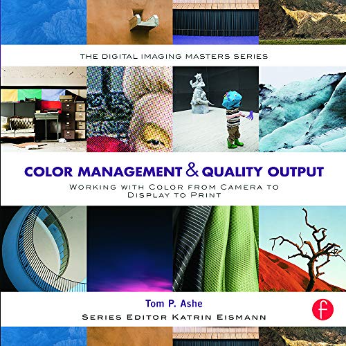
Color Management & Quality Output: Working with Color from Camera to Display to Print: (The Digital Imaging Masters Series)
As an affiliate, we earn on qualifying purchases.
As an affiliate, we earn on qualifying purchases.

MSA 10110489 Altair 4X Multigas Detector & Calibration Kit + Pump Probe
- Extended Sensor Life: Four-year sensor lifespan for reliability
- Long Battery Life: 24-hour continuous operation
- Multi-Gas Detection: Monitors LEL, O2, CO, H2S
As an affiliate, we earn on qualifying purchases.
As an affiliate, we earn on qualifying purchases.